

Brochure printing isn’t the sexiest, but it’s necessary for relaying information about your company, products or services. These advertising staples can get a little stale, so we’ve put together some tips to make your brochure memorable and informative.
1. Brochure Printing Tip #1: Select the best paper
100lb cover paper makes a big difference compared to 100lb text paper. It is surprisingly sturdier, which makes your brochure look more professional and durable.
Most printers have a variety of house paper from which you can choose. Felt, linen, gloss and matte are four popular options that are affordable but feel more substantial than text paper.
Felt brochure
Brochure on gloss paper
2. Brochure Printing Tip #2: Less words, more pictures
The average reader glances at the cover of a brochure for less than 5 seconds before deciding if he or she wants to read it. Make sure your headline is intriguing and graphics are aesthetically pleasing.
Simple, pretty brochure cover
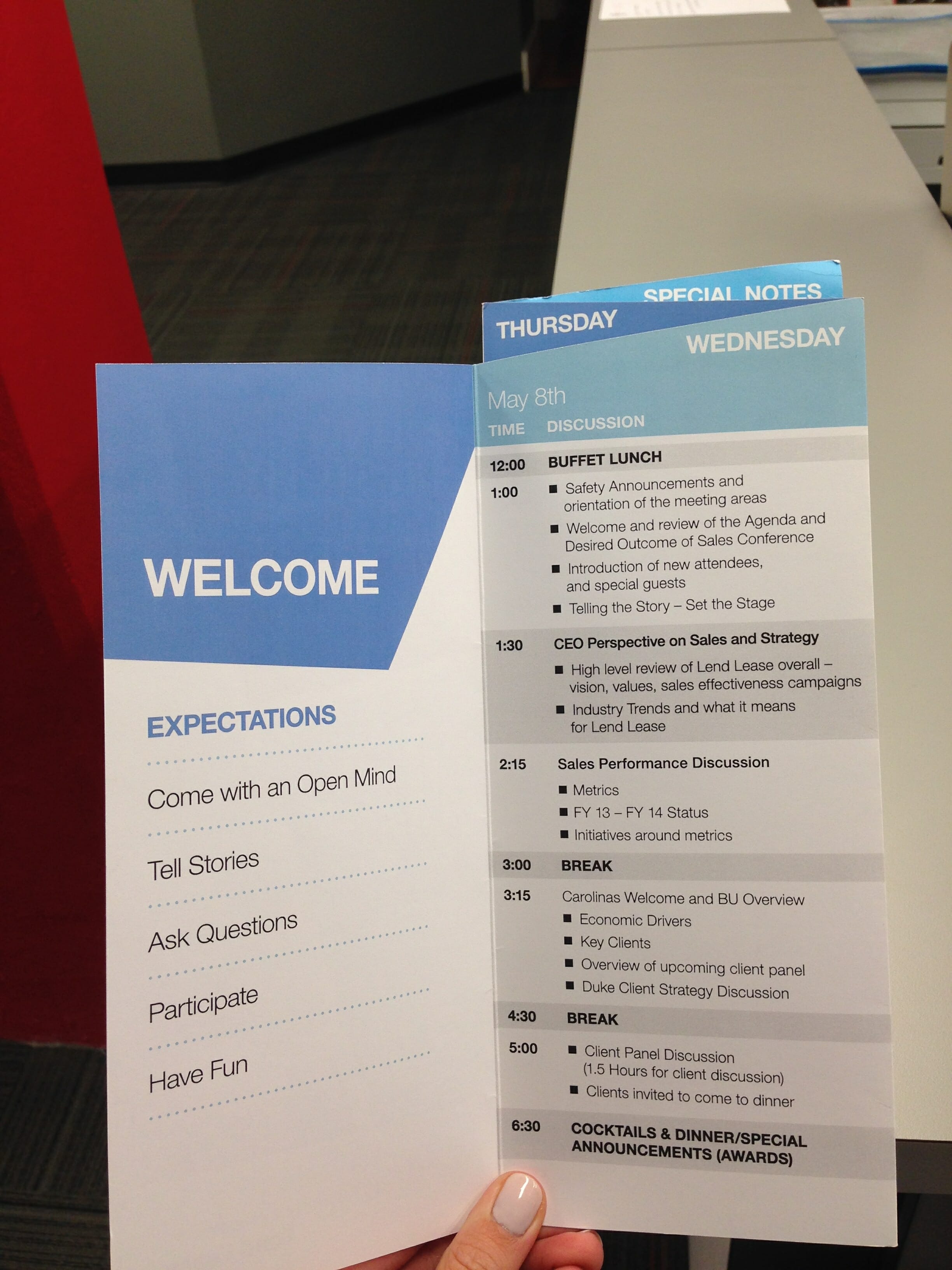
The same goes for the guts (or inside) of the brochure. Use bullet points, large fonts and fewer words to get your point across. Consumers are busy and have short attention spans.

Simple, pretty brochure
3. Brochure Printing Tip #3: Be better than the trifold.

We all love a good trifold. With good design and intriguing copy, a trifold can be a very effective medium for relaying information. However, most people use a classic trifold as their brochure layout of choice, so it becomes harder to stand out. There are so many different folds that people forget, such as the ones below.
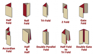
Brochure folding types
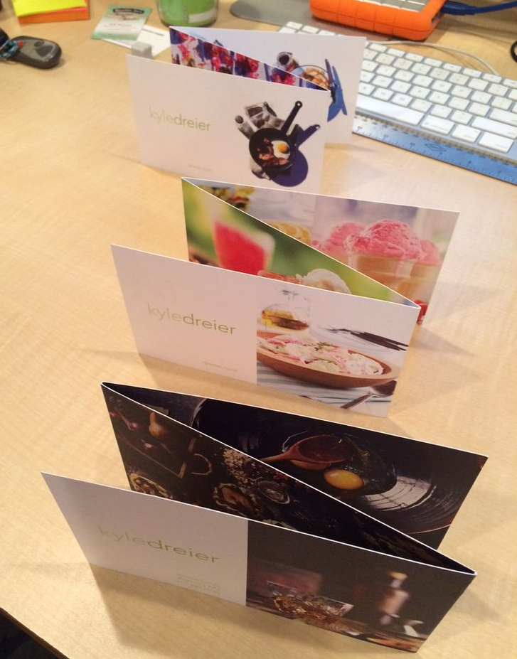
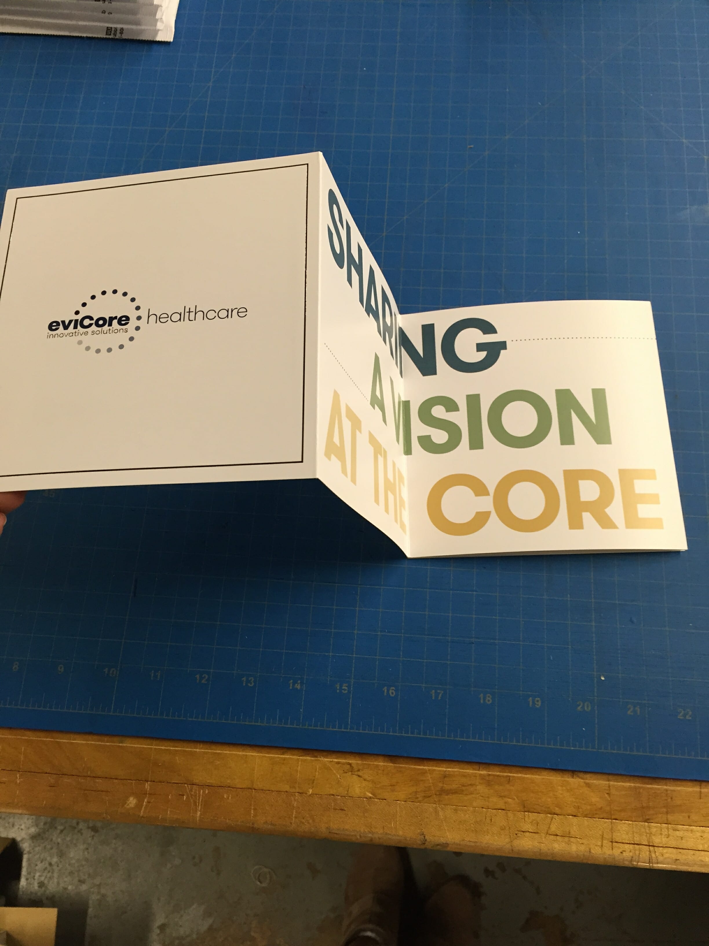
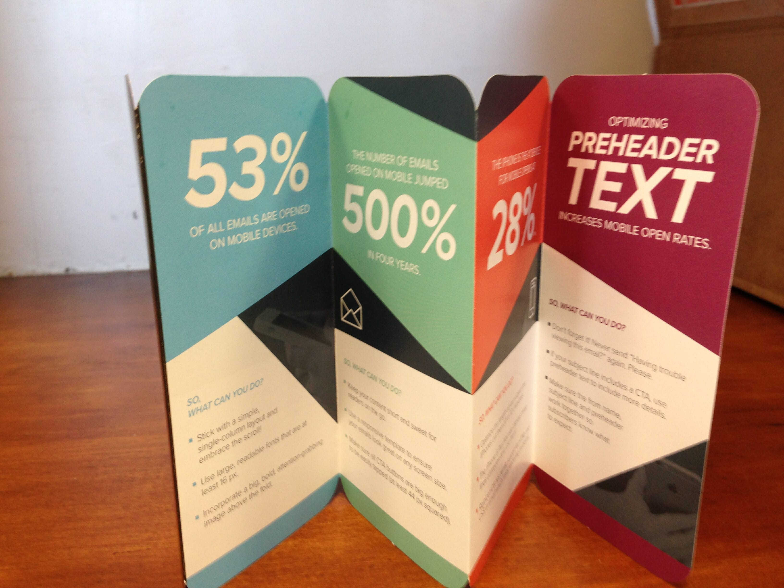
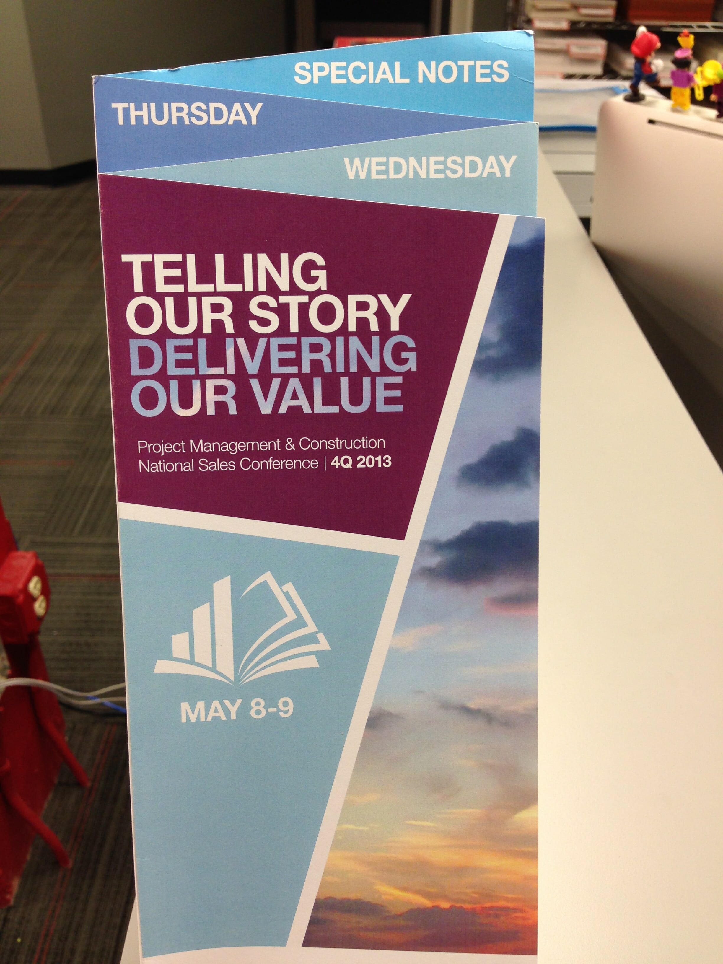
One of our favorites is the z-fold, also known as the zig-zag or accordion fold. Some people differentiate the z-fold and accordion fold by panels, as a z-fold typically has six panels and an accordion has 8 or more, but they are folded the same way. If you look at a z-fold from an aerial view, it will look like the letter “Z.”
Pretty z-fold brochure
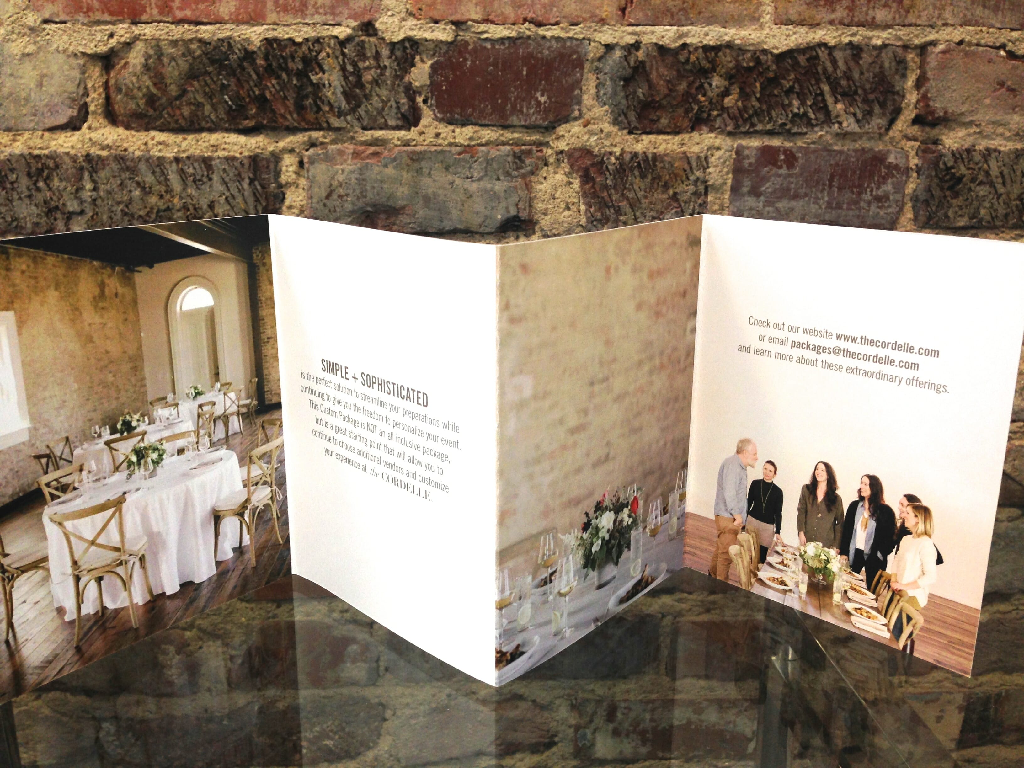
A z-fold is beneficial because of its versatility. The brochure can open with one pull, allowing the design to be able to span the entire sheet of paper.
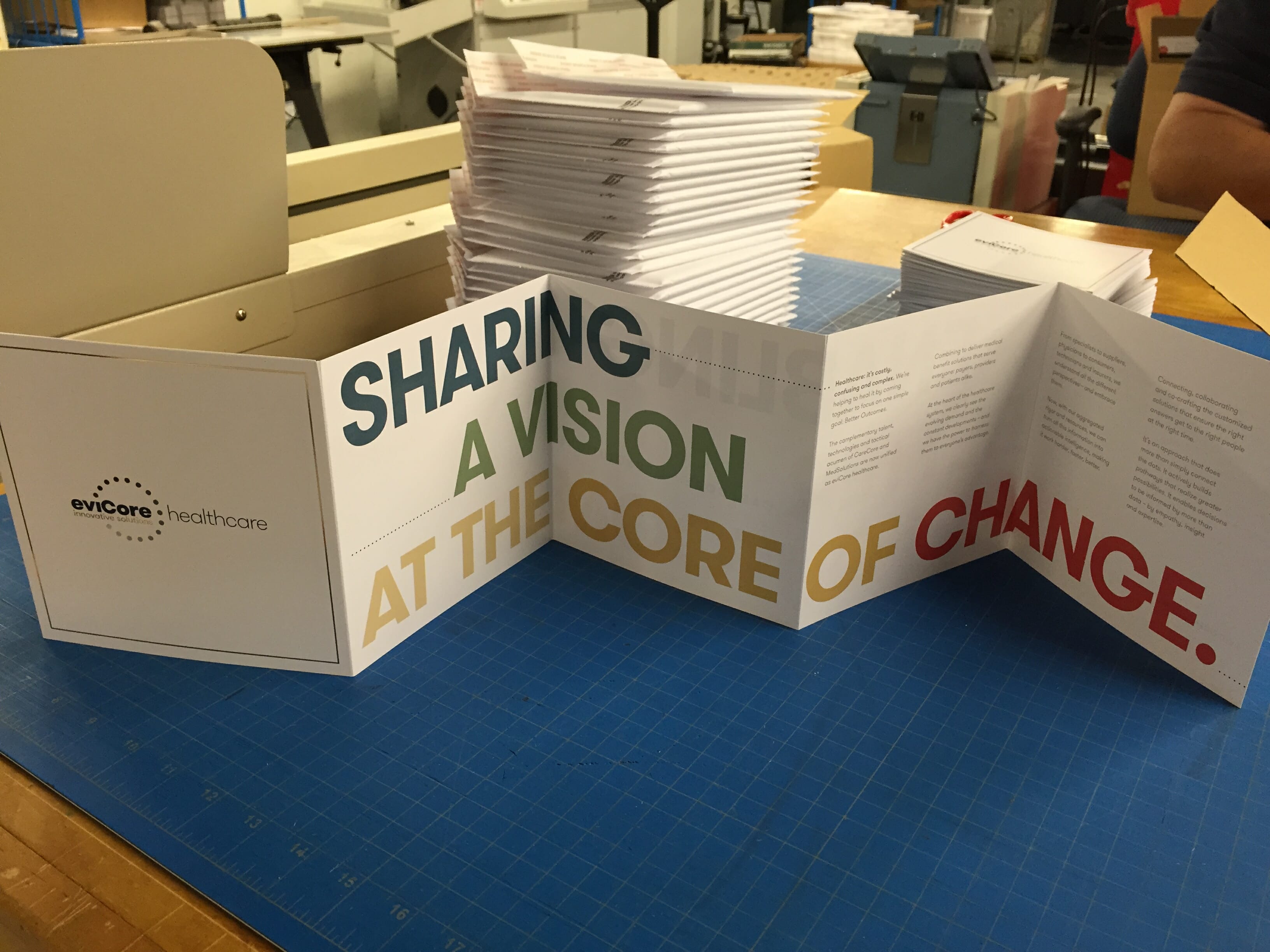
Z-fold brochure with cross-panel design
If you do choose to go with a trifold, we recommend making tiny tweaks, such as making one flap short or making the brochure more square than rectangular. It’s different enough that it makes the brochure stand out.
square trifold
Short-fold trifold
4. Brochure Printing Tip #4: amp up your design game
A good design welcomes a reader into the brochure. The best designs are relatively simple in nature and reinforce the overall message of the brochure.
A basic but crucial design tip is using complementary colors to create visual harmony.

Well-designed brochure using complementary colors
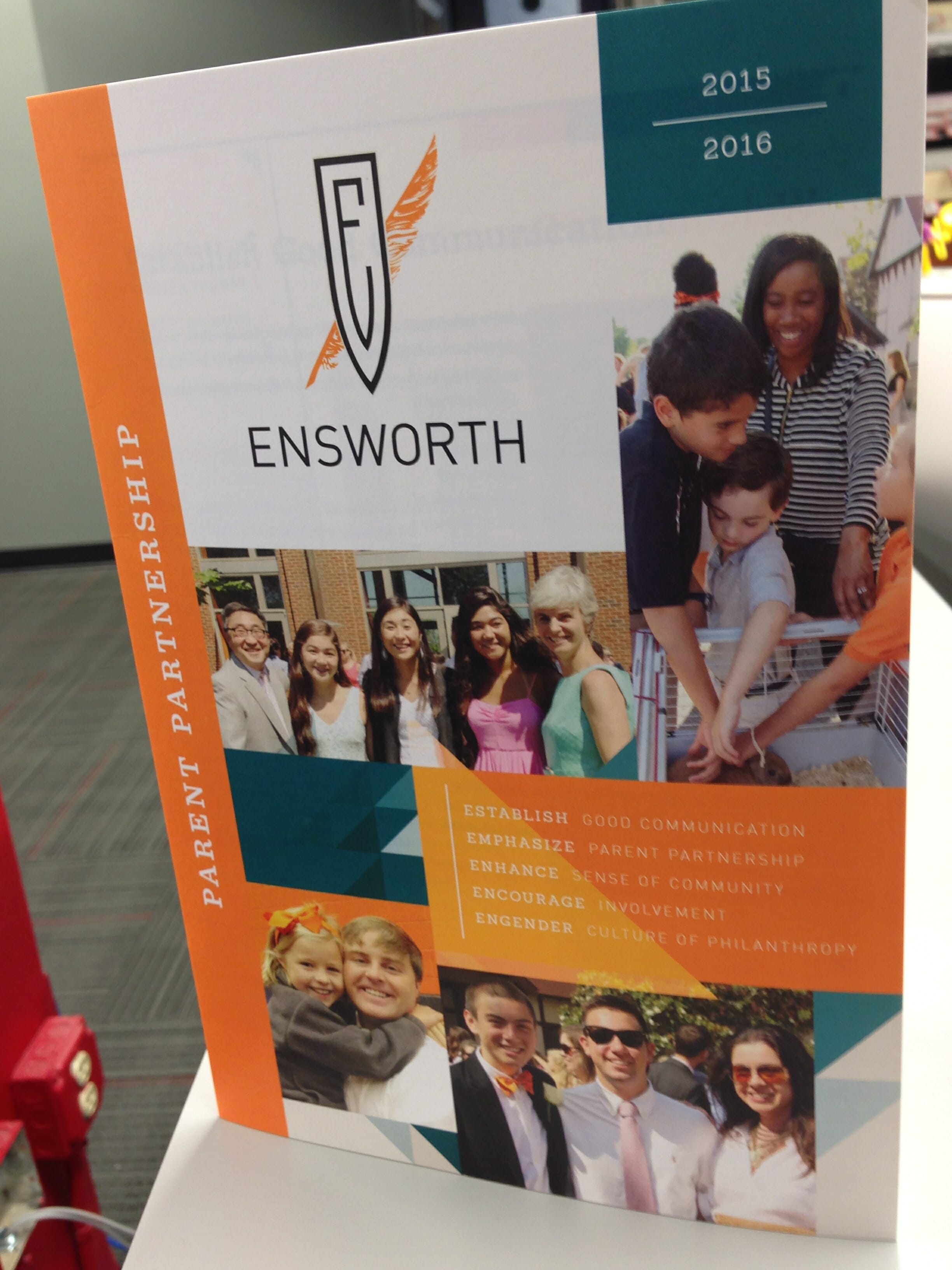
Above, Ensworth uses their signature color, orange, with its complementary color, blue, to create a brochure that is visually appealing and balanced.
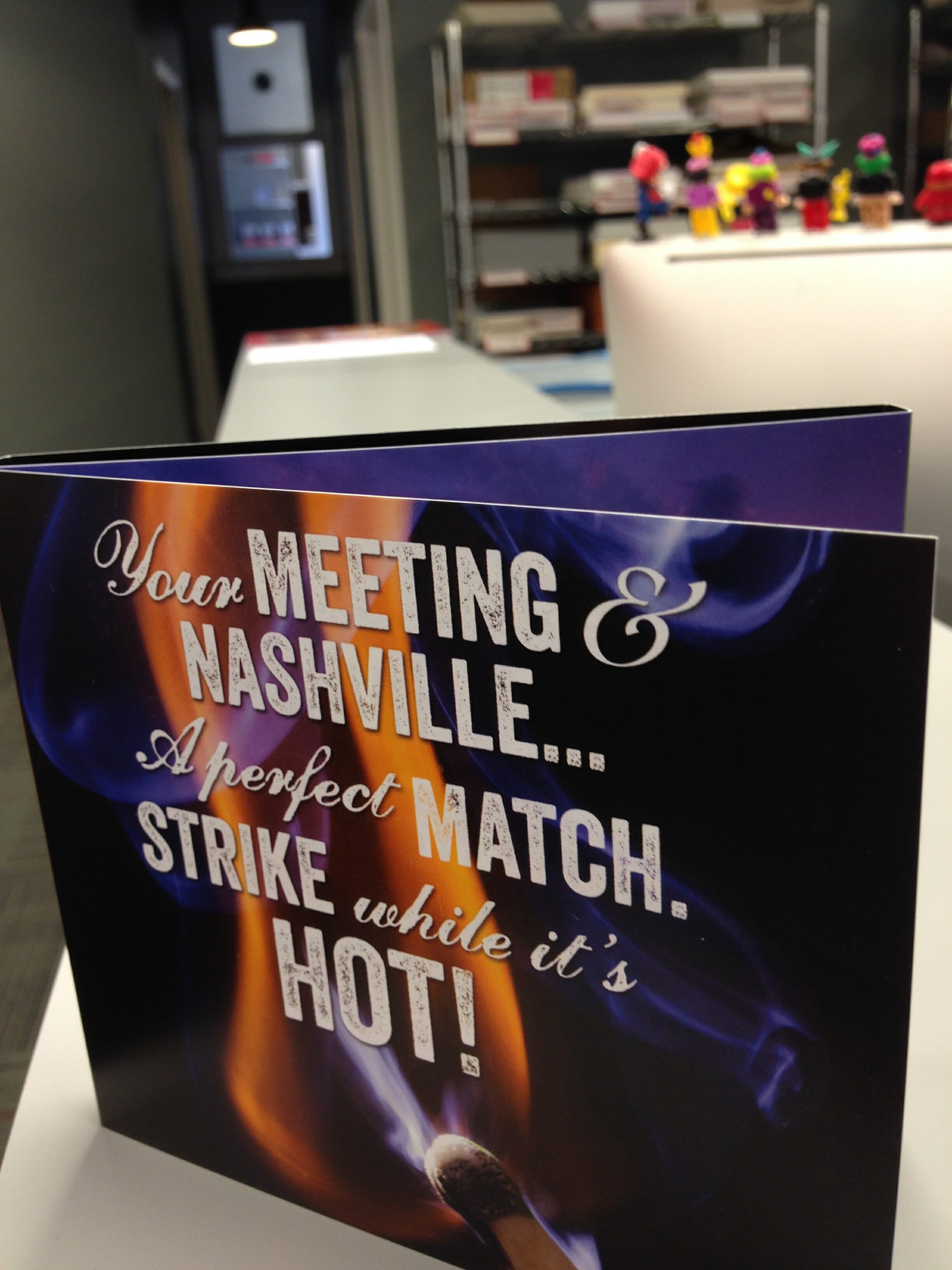
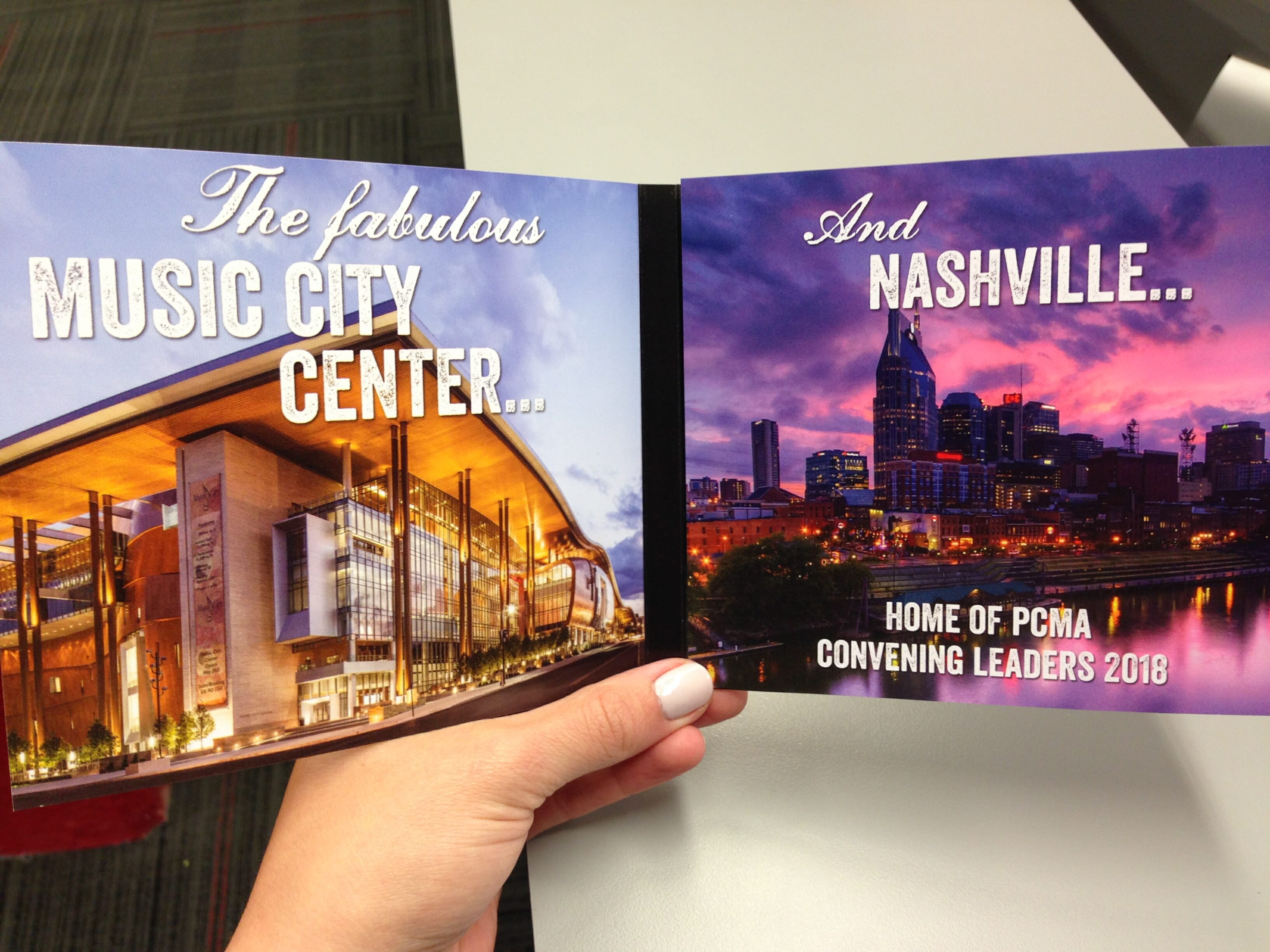
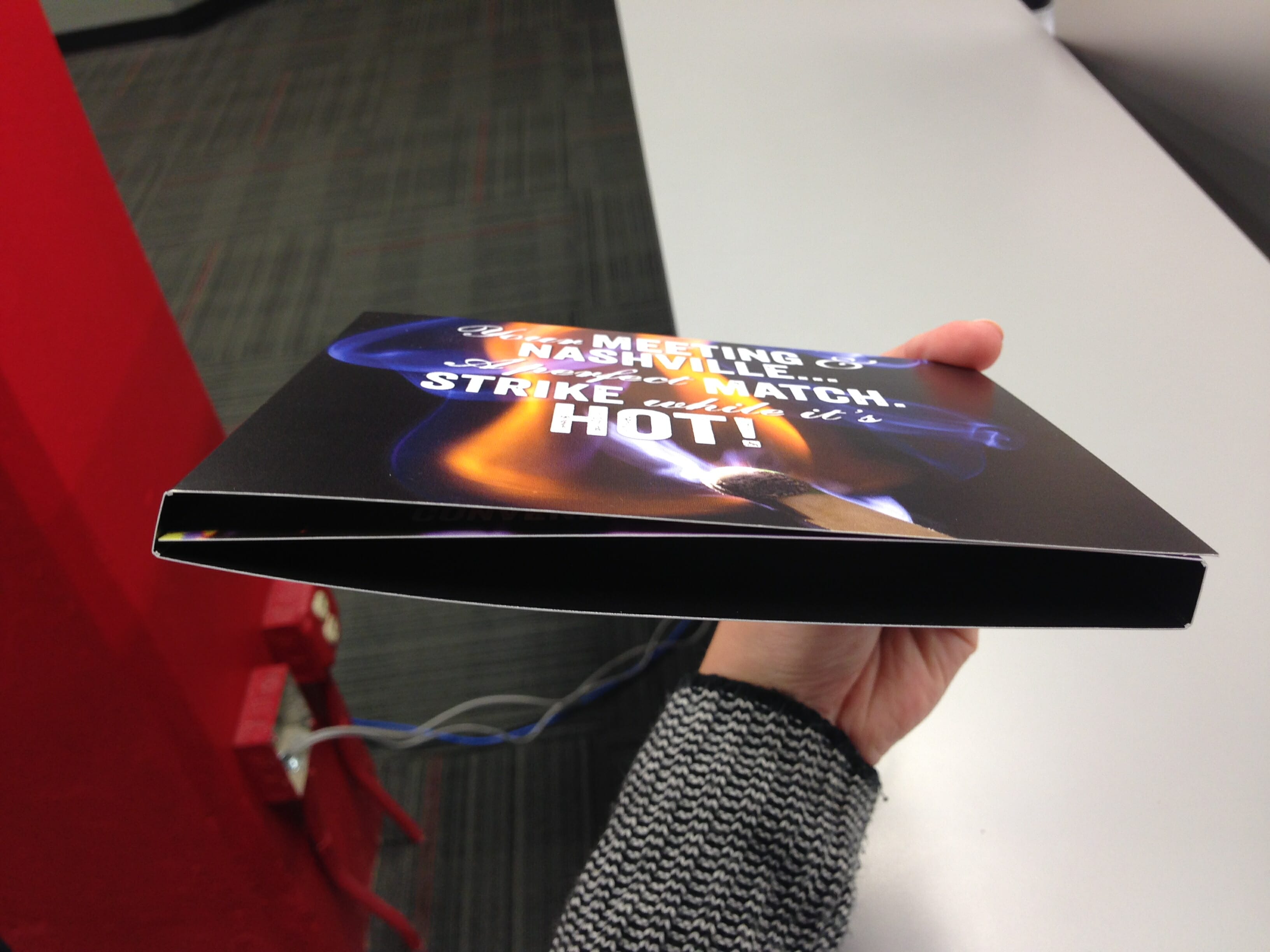
In addition to using complementary colors, a designer can choose to create a layout in the shape of its company’s message. For example, the brochure below, designed to look like a CD cover, is supposed to convince out-of-state companies to use Nashville as the place to hold conventions or meetings. The CD cover plays on Nashville’s reputation as “Music City USA.”
Brochure designed as a CD cover
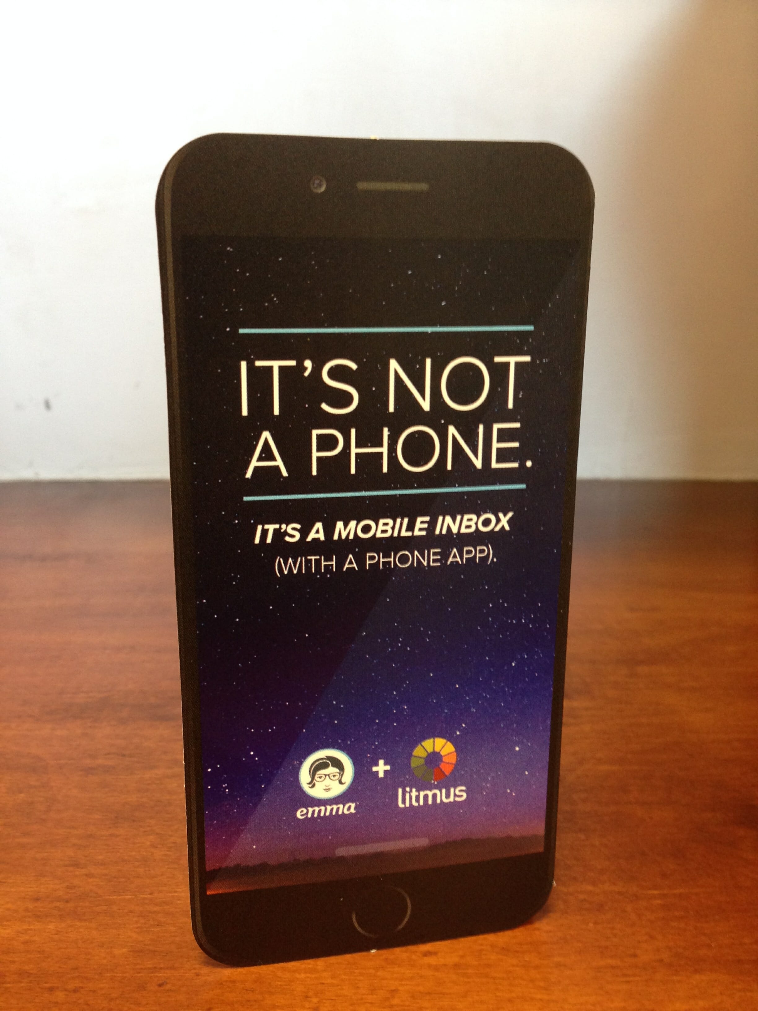
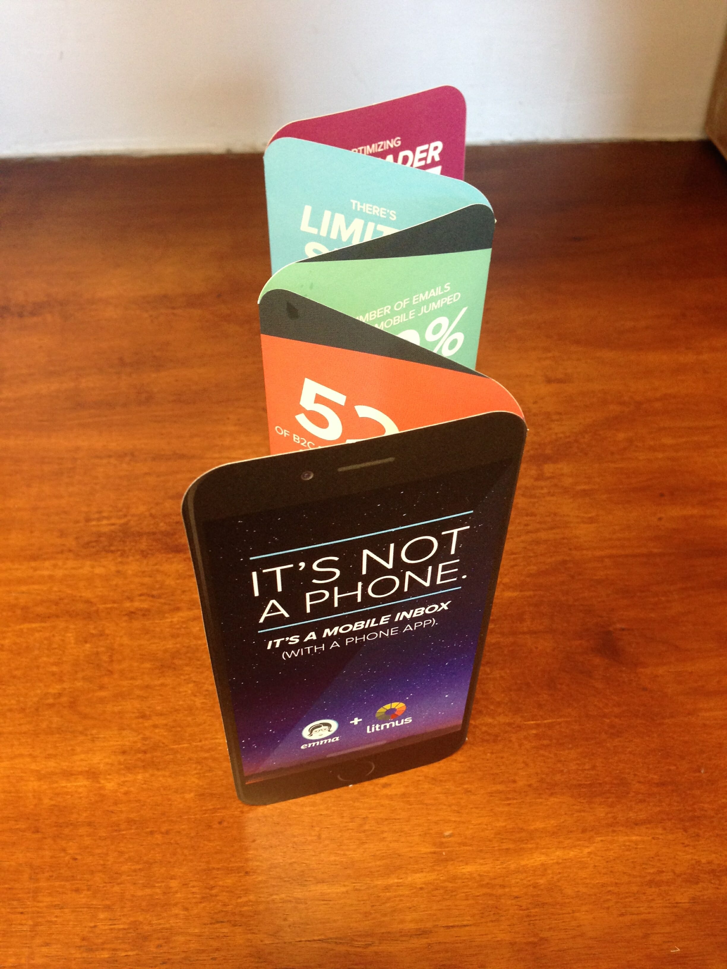
Emma, a successful company that offers email marketing services, created a brochure in the shape of an iPhone to reinforce the brochure’s message that a phone is becoming a mobile email inbox. It’s genius!
Die cut brochure
Die cut brochure
Die cut brochure
5. Brochure Printing Tip #5: Add finishing
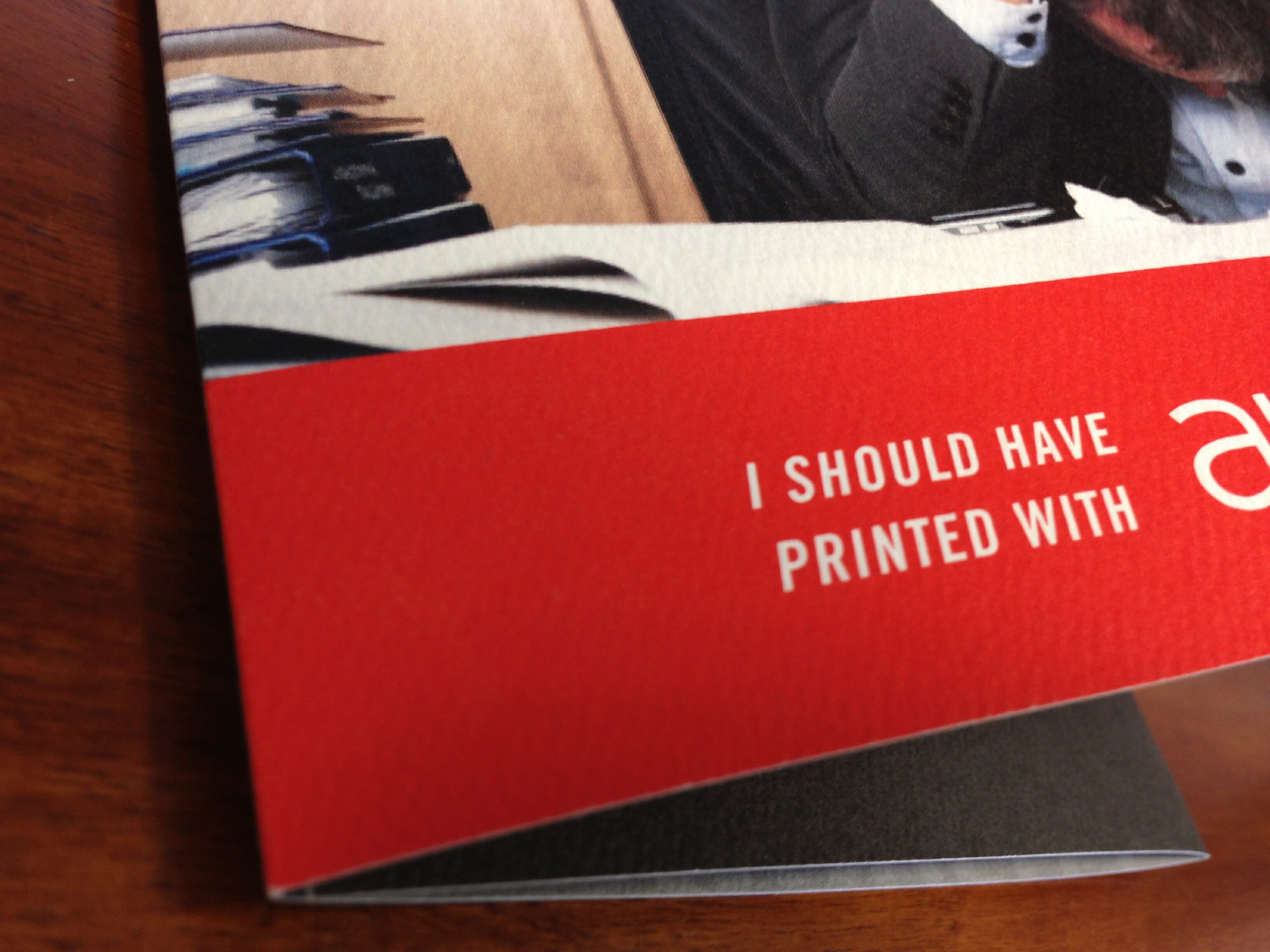
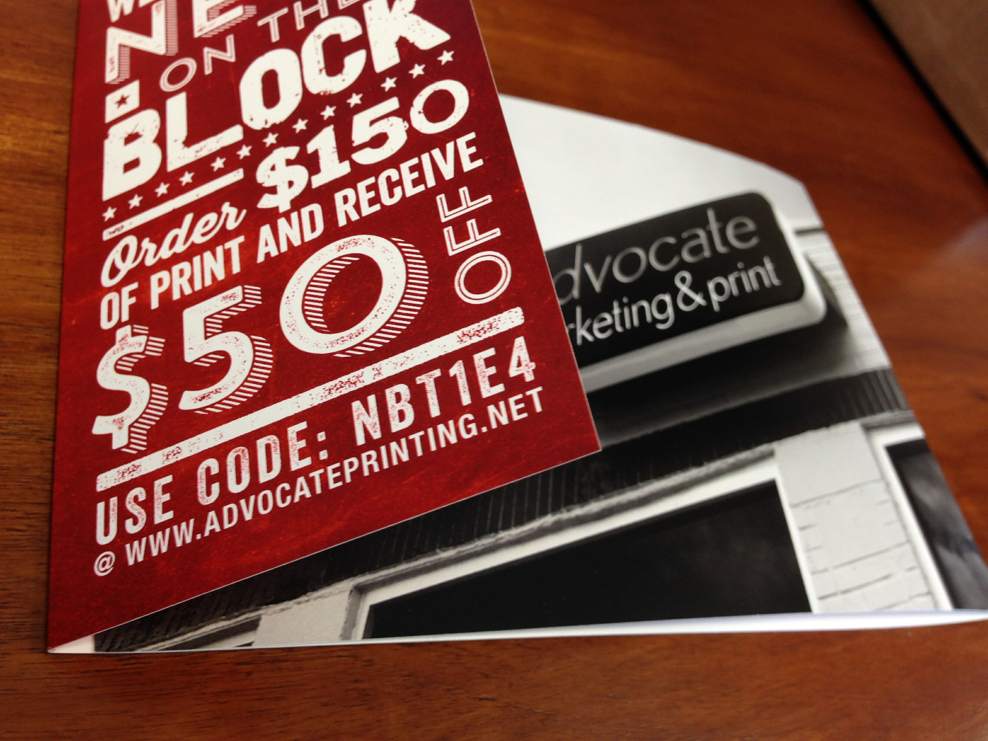
As with everything else we print, a good finishing technique can make the difference between an average brochure and great brochure. Die cutting, embossing, foil stamping and laminating are a few we use to make a brochure really stand out.
Foil stamped brochure
Die cut brochure
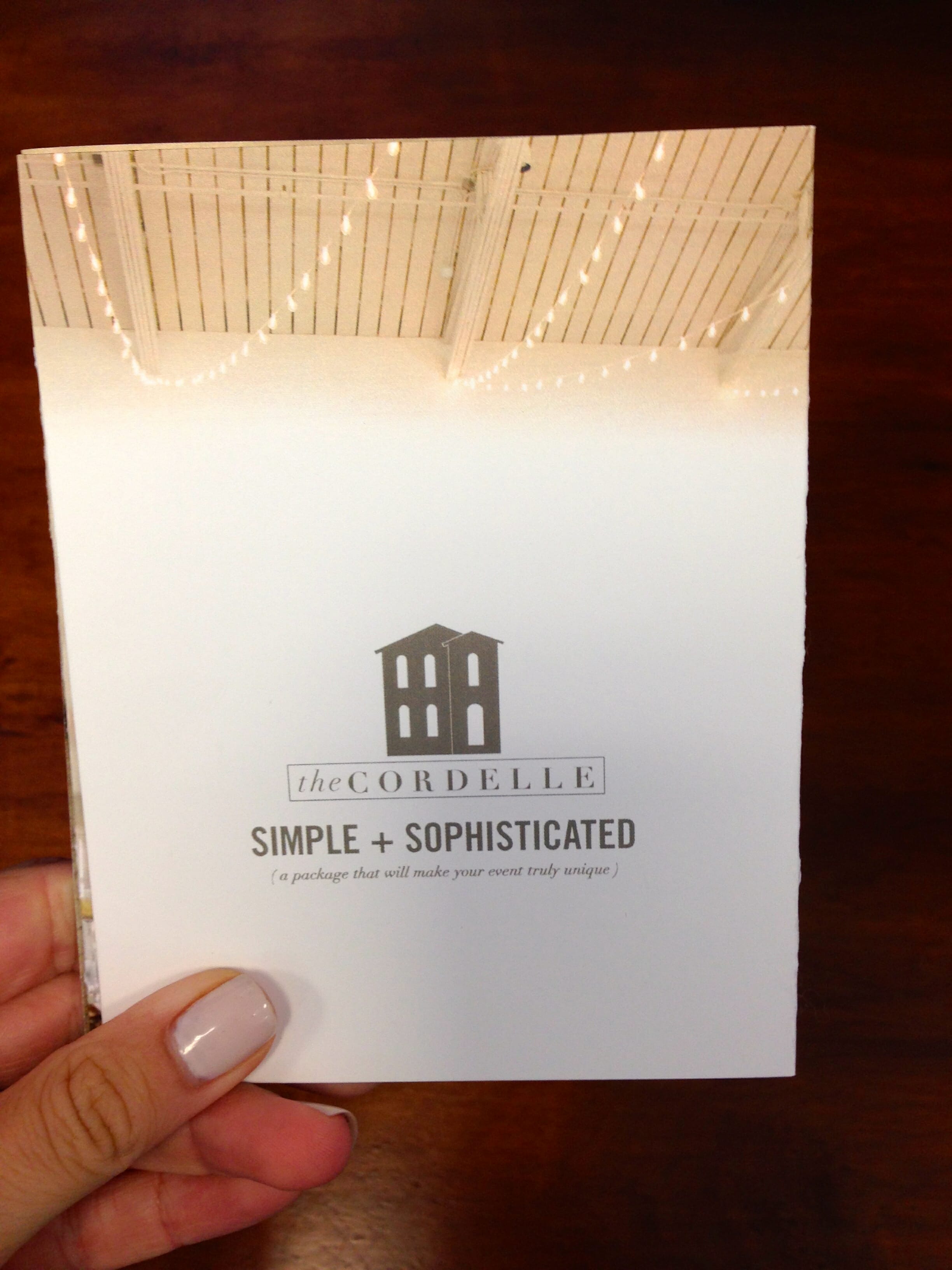
Brochure with asymmetrical edges
Brochure with asymmetrical edges
UV-coated brochure