

QR Codes have become commonplace as mobile device manufacturers have integrated the ability to scan them into basic camera functionality vs. having to use standalone apps to interact with them. These handy abstract square codes can be embedded to take you to a website, open apps, automatically add a contact to a device and so much more when used to their potential. Unfortunately, they have drawbacks as well, primarily in how they are designed for printing. Let’s take a look at a few of the pitfalls and how you can avoid them.
1.) Contrast
When adding a QR Code to your layout contrast is key! If you are using color or an image as the background of your layout, your QR Code should not lay over it. Instead use a white background with the code in black. You can invert it to white on black, but know that not all devices can read an inverted code so it’s best to avoid them. Additionally, the scanning function on most all devices have difficulty with codes that appear faded or monochromatic in relation to the rest of the printed piece. QR Codes are different so make sure they look the part!
2.) It’s Hip To Be Square
While it is possible to tweak the shape of a QR Code in your design, know that your QR Code is meant to be square. Devices are looking for the “eyes” of the code (those little squares in the top two corners as well as the bottom left corner. If they are not proportionally equal distances from each other, most devices will not realize it is a QR Code at all, rendering them useless. Having a code that is proportionally square ensures your greatest chance of success!
3.) Let Them Breathe
All designers want to ensure they use as much available real estate as possible, and we agree… except with QR Codes. Just like above, it’s all about contrast. Leaving space along the edge of your code will aid in devices recognizing it. The rule of thumb is whatever the size of a single module of your QR Code (a single square within the overall code), you should leave 4 times that width around each side of your code as dead space in the same color as the background of your code (ideally white).
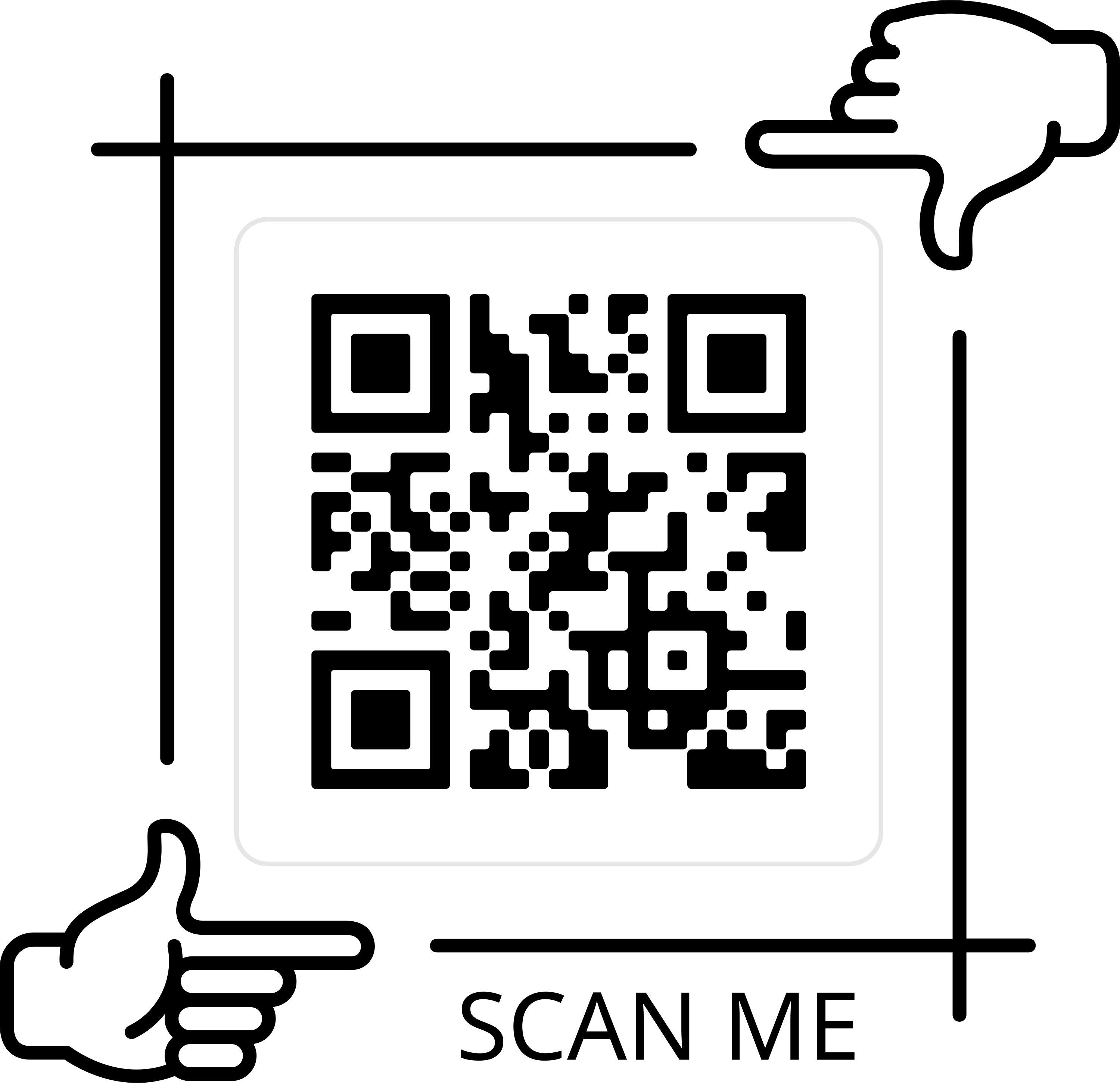
4.) Show It Off
Historically QR Codes have been a footnote of an overall design. With their increased usability that has changed. They are a call to action! Since they give the user access to high value information, put them front and center. The easier it is to find and scan, the easier it will be for people to interact with them. Your goal is to get people to scan them so make sure they can see it in the first place.
5.) Get Framed
So you have a QR Code, but what does it do? Give it room to breathe as we talked about above, but a lightweight frame and a short message explaining what the code does (See More Info, View Gallery, Contact Info etc.) tells the viewer what the benefit of scanning your code is to them.
6.) Bigger Is Better
As a rule of thumb, 2cm x 2cm is a minimum size for your code, but it’s not the final size for every code. As QR Codes evolve in what they can do, the more detailed the code becomes. If you are giving someone detailed contact information, your code will look like static at 2cm x 2cm and most devices won’t recognize it. ALWAYS request a printed proof if you are using a QR Code and then check it. Don’t check it with just your device, but with as many different devices as possible. Camera resolution can be a factor with highly detailed codes and most people do not have the latest and greatest device in their pocket. Don’t lose out on someone being able to scan your code just because it was too small.
7.) Check Your Content
What happens when the link on your site changes? Can your code adapt? If you are using most freebie code generators this is the case. Unless your code is for a short-term application, spend some time looking at Dynamic Code generators. These hosted style codes typically offer an admin interface that allows you to update the URL the code is being directed to, thus allowing you to update what all your codes over time without having to create new codes or update your print files. Most services also provide tracking and data on how many times your code has been scanned which can help validate their success.
8.) Materials Matter
While QR Codes are part of your overall creative design, if you are not careful the media you apply them to can cause them to be difficult to scan. Textured paper, gloss coating and clear decals are just a few types of substrates that can cause readability issues. Ultimately the testing of your code at the proof stage can help mitigate issues, but it’s best to keep this in mind in the design phase to keep from wasting effort in the long run.
Don’t be afraid to use a QR Code. Applied correctly they can be a key part of your overall print campaign. Just know there is no one perfect way to use them, but when used correctly can be highly effective in increasing engagement and the overall user experience!