An eye-catching letterhead, like a good business card, is a crucial marketing opportunity. Sometimes it will be the first correspondence a customer has with you; sometimes it will be used to strengthen and reinforce your brand.
Whether you are making an announcement, asking for a donation or saying thank you, a well-designed letterhead adds validity to the words on the page. It forces your reader to take a second look and take the message more seriously.
1. Simple is best
Simplicity is a good design principle no matter the medium. But for letterhead, especially, simplicity is crucial. After all, a letterhead is supposed to deliver a message. You want your design to reinforce the words, not distract from them.
2. Omit unnecessary details
The only detail that is necessary on a letterhead is your logo. Everything is else is optional. The company address is available on the envelope, and customers can easily Google your phone number, email or website. However, if your company is small or just starting up, we recommend printing one preferred method of communication, such as an email address.
3. Use hierarchy
This may be intuitive, but place the most important information at the top and/or left side of the page. The eye naturally looks to the top, left side of any reading material, so you want to convey the most important content first. The eye also tends to notice the largest font or design first, so make sure to increase the size of the most prominent piece of information. Make the secondary information, such as email, phone number and address smaller (unless that happens to be your most crucial information).

4. Use exact brand font (and colors)
This is a design principle you should follow when creating any branded material. Our brains tend to remember illustrations better than words, which is why you have a logo in the first place. If you use dark blue when your brand color is baby blue, it will confuse your customers and weaken your brand overall.
Occassionally you can get away with changing up the colors — but the design and typography must remain the same to instill brand recognition among consumers.
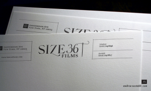
5. Balance
Another intuitive design principle is balance and positioning. You want to arrange your content in a way that creates symmetry. If you have your logo in the top left, maybe place a design on the bottom right corner. Or if your logo is centered at the top, try centering the address, phone number and email at the bottom. Your brain naturally looks for symmetry, and it makes us feel uncomfortable when it’s not there. For example, the letterhead below does not have any symmetry — the content is all crammed into the left side.
Some designers knowingly create asymmetric designs in order to grab readers attention. It’s a bold design move, but sometimes a good designer can pull it off.
Designed by Blok Design
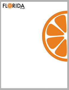
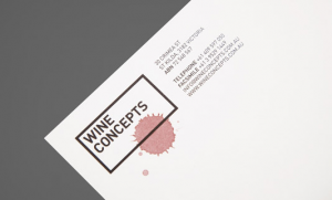
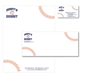
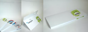
6. Incorporate your products or services
People appreciate clever design. If there is a way to convey your products and services without telling readers, do it. It will give more credibility to your company or brand. Readers will think you are smarter than the competition, and they will appreciate you more. It also makes your brand or company more memorable.
Designed by Hunt & Co.
Designed by Lizzy Green
By Jerry Cheng
7. Add specialty printing techniques
Yes, yes — we say this every time. But it’s true! Specialty printing techniques such as foil stamping, edge painting, embossing, debossing and die cutting make your brand appear more professional and/or creative. The same goes for specialty, thick paper. We are tactile creatures, and we like things that have a unique feel. It increases customer engagement and triggers more memory receptors in the brain.
Letterhead w/ foil stamping
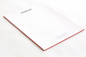
Letterhead on thick paper with colored edges
Letterpress letterhead (debossed)
Die cut letterhead
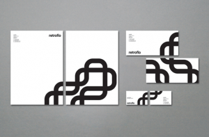
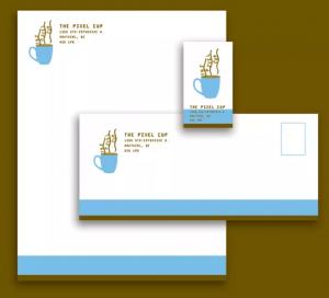
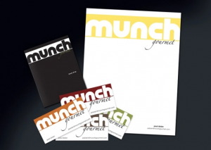
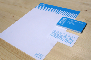
8. Match your letterhead with your other print products
Similar to using the exact brand font and color, ensure that the overall design of your letterhead is similar to your business card, stationery, envelope and other print products. It creates brand cohesion and strength. If you want to be really neat-o, have the designs of your letterhead and business cards to form a larger design when placed side-by-side, as in the one below.