Keep up with the latest around the amp shop by following our social media feeds!
AMP ON INSTAGRAM
AMP ON FACEBOOK
Problem displaying Facebook posts. Backup cache in use.
Click to show error
Keep up with the latest around the amp shop by following our social media feeds!
While the Adobe suite of production like InDesign and Illustrator have been a staple in the design and print world for decades, a new product has recently taken the design world by storm. With a simple to use design interface, a low entry cost for new users and a drag and drop, web based design Canva (www.Canva.com) is rapidly becoming a go-to design tool for simple, easy to use design for both digital and print marketing.
As with any new platform, there are some “quirks” to getting the most from Canva. Below are a few of the basics you should ALWAYS follow when using Canva for print design.
Set Your File For Print
One of the biggest issues we see with Canva designs is the bleed (that little extra around the edge printers need to trim your prints all the way to the edge and not leave tiny white edges). Canva actually has a setting to help you achieve the same bleed the AMP team needs for your prints (1/8” on each side).
To see the bleed area of your file, select FILE in the top left corner and then check SHOW PRINT BLEED. This will extend the edge of your image the extra 1/8” on each side. Now all you have to do is ensure that your background or images extend all the way out into this space as needed. If you have a white background to your print, there is nothing to extend, but you still need to turn on the bleed feature.
When making adjustments, known that anything in the 1/8” bleed area will be trimmed off your print in the finishing process so if you want it to show up on your print, don’t let it creep into the bleed area.
DOWNLOAD FOR PRINTING
Unlike an image you are using for digital only visuals, a print file is a bit more involved. In addition to bleed which we talked about above, crop marks are also needed to ensure we trim your printed file correctly.
Start by clicking the DOWNLOAD (the arrow pointing down in the top right corner).
Next, under FILE TYPE pull the menu down and select PDF PRINT if it’s not already selected.
Lastly, check the box next to CROP MARKS AND BLEED. This will create your print ready PDF with the 1/8” bleed and crop marks both showing in your PDF that you are going to send us.
Now you can press DOWNLOAD and Canva will create a PDF file for you to send us that is ready to print.
CONVERT YOUR FILE TO CMYK
Canva by default creates files in RGB as it was initially designed to create digital only images for your RGB screen, yet all of our printing is done in CMYK. We can convert your PDF files to CMYK, but there is typically some color shift in this process as you are now using 4 base colors (Cyan, Yellow, Magenta and Black) instead of 3 base colors (Red, Green and Blue) to create the colors in your image.
For this reason it is best for you to use a simple CMYK conversion tool like pdf2CMYK (https://www.pdf2cmyk.com) so you can see the color changes prior to sending us your file. It will save time in the order process by eliminating the need for you to do a redesign after you see the file we converted to CMYK.
GO CREATE!
These are just a couple of the basic issues we have seen as Canva has come on the scene and are in no way the only things to watch out for. You still need to follow basic design principles for print materials such as high resolution images etc.
As with any design tool, it’s only as good as the content you put in to it. If you are just not able to get the results you are wanting in the design process, let us know! The AMP team of designers are here to take your ideas and create exactly what you need!
QR Codes have become commonplace as mobile device manufacturers have integrated the ability to scan them into basic camera functionality vs. having to use standalone apps to interact with them. These handy abstract square codes can be embedded to take you to a website, open apps, automatically add a contact to a device and so much more when used to their potential. Unfortunately, they have drawbacks as well, primarily in how they are designed for printing. Let’s take a look at a few of the pitfalls and how you can avoid them.
1.) Contrast
When adding a QR Code to your layout contrast is key! If you are using color or an image as the background of your layout, your QR Code should not lay over it. Instead use a white background with the code in black. You can invert it to white on black, but know that not all devices can read an inverted code so it’s best to avoid them. Additionally, the scanning function on most all devices have difficulty with codes that appear faded or monochromatic in relation to the rest of the printed piece. QR Codes are different so make sure they look the part!
2.) It’s Hip To Be Square
While it is possible to tweak the shape of a QR Code in your design, know that your QR Code is meant to be square. Devices are looking for the “eyes” of the code (those little squares in the top two corners as well as the bottom left corner. If they are not proportionally equal distances from each other, most devices will not realize it is a QR Code at all, rendering them useless. Having a code that is proportionally square ensures your greatest chance of success!
3.) Let Them Breathe
All designers want to ensure they use as much available real estate as possible, and we agree… except with QR Codes. Just like above, it’s all about contrast. Leaving space along the edge of your code will aid in devices recognizing it. The rule of thumb is whatever the size of a single module of your QR Code (a single square within the overall code), you should leave 4 times that width around each side of your code as dead space in the same color as the background of your code (ideally white).
4.) Show It Off
Historically QR Codes have been a footnote of an overall design. With their increased usability that has changed. They are a call to action! Since they give the user access to high value information, put them front and center. The easier it is to find and scan, the easier it will be for people to interact with them. Your goal is to get people to scan them so make sure they can see it in the first place.
5.) Get Framed
So you have a QR Code, but what does it do? Give it room to breathe as we talked about above, but a lightweight frame and a short message explaining what the code does (See More Info, View Gallery, Contact Info etc.) tells the viewer what the benefit of scanning your code is to them.
6.) Bigger Is Better
As a rule of thumb, 2cm x 2cm is a minimum size for your code, but it’s not the final size for every code. As QR Codes evolve in what they can do, the more detailed the code becomes. If you are giving someone detailed contact information, your code will look like static at 2cm x 2cm and most devices won’t recognize it. ALWAYS request a printed proof if you are using a QR Code and then check it. Don’t check it with just your device, but with as many different devices as possible. Camera resolution can be a factor with highly detailed codes and most people do not have the latest and greatest device in their pocket. Don’t lose out on someone being able to scan your code just because it was too small.
7.) Check Your Content
What happens when the link on your site changes? Can your code adapt? If you are using most freebie code generators this is the case. Unless your code is for a short-term application, spend some time looking at Dynamic Code generators. These hosted style codes typically offer an admin interface that allows you to update the URL the code is being directed to, thus allowing you to update what all your codes over time without having to create new codes or update your print files. Most services also provide tracking and data on how many times your code has been scanned which can help validate their success.
8.) Materials Matter
While QR Codes are part of your overall creative design, if you are not careful the media you apply them to can cause them to be difficult to scan. Textured paper, gloss coating and clear decals are just a few types of substrates that can cause readability issues. Ultimately the testing of your code at the proof stage can help mitigate issues, but it’s best to keep this in mind in the design phase to keep from wasting effort in the long run.
Don’t be afraid to use a QR Code. Applied correctly they can be a key part of your overall print campaign. Just know there is no one perfect way to use them, but when used correctly can be highly effective in increasing engagement and the overall user experience!
Below are a gathering of useful resources customers often need when submitting artwork, preparing to place an order and more!
MAX PRINT SIZES
Before deciding on how to design your file, you need to know how we will run the file.
DESIGN REQUIREMENTS
Now that you know how it will be produced, take a look a the file requirements.
FOLDING GUIDELINES
Prepping a file for folding can be tricky. Use this guide to better understand the nuances and styles.
ENVELOPE SIZES
There are numerous choices when it comes to envelopes. Here’s a simple guide to help you select the right one for your project.
With the Safer At Home order in place and most of the nation doing their part to keep businesses runnng, the amp team are also in the mix.
The office team are safely at home processing orders and prepping files for production. The production crew are working swing shifts to aid in keeping distance between them while still cranking out the high quality prinitng our customers expect from us.
A large segment of amp’s customers are those deemed essential and we’re here to help! Check out this quick video of a day in the shop as we support Whole Foods.
We’re here and ready to help! Contact us at order@advocateprinting.net to place and order or get a quote.
For many marketers, a reliance on digital marketing efforts makes sense in so many ways. Digital tools allow for easy targeting, easy attribution, and campaign launches at lightning speed, but they are also subject to a level of marketing fatigue and consumer filtering – leading to increasing ad spends and longer conversion lags.
Direct mail, on the other hand, has historically been clunky, cumbersome and lacking accurate conversion attribution. Because of this, many digital marketers have made the assumption that direct mail is dead – but that truly couldn’t be farther from the truth.
Let’s take a look at a few reasons that direct mail may be the missing piece to your marketing puzzle.
1.) Direct mail has higher response rates than other types of marketing. Recent Data and Marketing Association research shows targeting customers on a 1:1 level increases response rates up to 50% or more and that 40% of consumers try new businesses after receiving direct mail.
2.) People find direct mail a more personal way of marketing. Research from EZ24x7 shows that 56% of customers find print marketing to be the most trustworthy type of marketing.
3.) Millennials respond to direct mail! Polling done by Reach Dynamics shows among 18 to 24-year-olds, 69% say they prefer print and paper communications to reading off a screen.
4.) Direct mail can work hand-in-hand with the internet. In a recent article for Huffington Post, Ernesto Sosa, CEO of SOWEB, revealed research showing 90% of those heeding the call of a direct mail piece visited the companies website before making a call.
5.) Social Distancing is increasing the appreciation of direct mail. OK, we made that up, but if you are hiding from the Coronavirus you’ll appreciate receiving something exciting in the mail!
Time to complete your marketing puzzle with a new approach to direct mail? Contact the amp team to explore the latest in engaging and dynamic solutions for your business or organization.
Business Cards
According to money.cnn.com, Nashville is receiving 31,153 people every year and growing. With this growth, consumers simply are inundated with choices. This is a growth city but it also means that you’ve got to market and make calculated moves to stay in front of your audience here.
In order to start a successful business in Nashville – we’ve compiled a list of 4 things that you must have done before you cut the big red ribbon.
1. Be an active part of the community.
Join the Nashville Chamber of commerce: https://www.nashvillechamber.com/membership/investment-levels and get involved in what makes Nashville unique. Your membership will help you gain visibility, build a network and grow professionally. In addition, the Chamber will listen to your needs and advocate on your behalf regarding key legislative issues. Get connected with important players in Nashville business and create a network to help grow your brand.
Join the Nashville Entrepreneur Center: http://www.ec.co/ This non-profit supports entrepreneurs by providing valuable mentorships to help them navigate the path of a startup lifecycle. The Nashville Entrepreneur Center provides year-round initiatives in the music and healthcare communities as well as physical communities, where startups can have a home with options like co-working space and dedicated desks. Your membership will provide you valuable advice and networking.
What other local groups does your business work with? Research and join. You’ll make connections that will grow your business organically – through relationships. Nashville, despite its growth, will never be a New York or San Francisco. We are still a tight knit, helpful, and relationship-centered city. To grow here, become engrossed in the community and help. Cut throat business will get you nowhere but lending a helping hand without asking for anything in return will put people in your corner southern style.
2. Budget and Enlist Experts.
A common mistake new business owners make is thinking as long as they can get a large sum of money, they start a business checking account and surely it will suffice to cover expenses. It doesn’t work. Don’t get so busy in other aspects of the business that you lose track of spending and carefully curated books. Make a detailed budget before you spend a dime. If you aren’t an expert at budgeting and finance, enlist the help of someone who is. “So many startups make the mistake of hiring professional help after crucial moves have been made. Hire a professional early. You’ll save money and you’ll save yourself from making critical and costly mistakes” said Tommy Jacobs, CEO of Jacobs Cohen CPA, working with Nashville businesses for over 25 years.
Considering that a lot of entrepreneurs tend to be more “big picture” thinkers, crunching numbers is not a favorite task. As such, is too often glazed over. Think about every aspect of your business budget and make a plan, then stick to it. Be disciplined and thoughtful or you’ll be out of business. (forbes.com)
3. Spend Marketing Money Strategically.
If you want to be seen in the 7th fastest growing city in the country, you’ll want to make smart marketing materials and investments. This can mean staying prepared and printed with everything from business cards to banners. We like Advocate Printing https://advocateprinting.net as they have skilled designers on-hand, quick turnaround time, and good pricing.
When you create these materials make sure that you are thinking about the Nashville consumer, inundated with new choices. It would be wise to include your location or city subset in your marketing materials: “Edge Hill’s Finest Eatery” so that Nashvillians can find you. Don’t get caught up in a “cool vibe” and forsake functionality, websites, and basic information so that the inundated consumer is able to find you.
4. Start a social media following.
You don’t need brick and mortar or customers to start your buzz. Get on social media in as many avenues as possible. Nashville is full of artists, musicians, families, and professionals – reach out to each of these demographics within your target market and start somewhere. This might mean tweets like “Can’t wait to join the ranks of Nashville success like ______.” <-insert competitor” to bandwagon followers. Don’t wait until your grand opening. Do this now.
According to Entrepreneur magazine: “For those willing to hustle, the Nashville sense of community, camaraderie and friendliness opens some big doors.” In a city of 650,000+ we trust that you will feel right at home with your new business in the biggest little city in the country. Welcome ya’ll!
Introducing TEDxNashvillexAMP: signage ideas worth spreading. (Also known as TEDxNashville signage provided by AMP).
We had the honor of providing some really cool printed materials for TEDxNashville this April, which included badges, posters, booklets, Gator board stand-ups, window decals and — drum roll please — chalkboard panels. If anyone puts on a great event, it’s TEDx, and we are so excited to show you our collaboration with the innovative speaker series.
A staple of any event are badges. Whether you’re a volunteer, speaker, sponsor or attendee, you want to have some sort of identification that directs you to the right location and informs you of others’ names and roles. Laminated badges with lanyards are the best, as they are easily visible and hard to lose. Some events will even add specific information on the back to further help attendees.
TEDxNashville badges*
TEDxNashville badges*
Booklets and posters are essential for directions and information. They are especially necessary if your event lasts several days, has multiple sessions or your location is large and/or difficult to navigate.
TEDxNashville badges, poster and booklets*
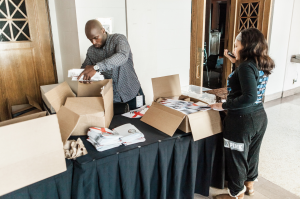
TEDxNashville booklets*
Gator board stand-ups are posters on steroids. They have more space to direct and inform guests, and if you are smart, you will use your logo to advertise and reinforce brand identity.

TEDxNashville banner stand*
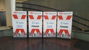
TEDxNashville banner stands
One of our favorites. Window decals make you look like a boss man (or lady). It just makes your event appear cooler. Guests know this isn’t some last-minute event thrown together the night before; it’s a professional experience well worth the money and time.
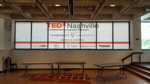
TEDxNashville window decals
This was a first for us: chalkboard inspiration panels. The installation was actually plywood, but we attached a chalkboard vinyl to the surface to recreate the effects of chalkboard. The panel had three sides, each posing a different question:
1. “When I dream about Nashville, I see..”
2. “If money and time were not an issue, I would create..”
3. “Someone who inspires me..”
Chalk was available at the bottom of each panel, allowing guests to write at his or her convenience. It was a great way to interact with attendees, and it reinforced the motto of “ideas worth spreading,” a phrase TEDx reiterates. The panels also made for some pretty neat photos!
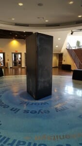
TEDxNashville chalkboard panels
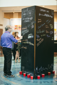
TEDxNashville Chalkboard panel**
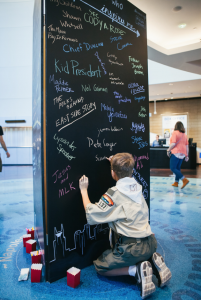
TEDxNashville Chalkboard panel**
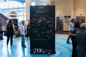
TEDxNashville Chalkboard panel**
*photo taken by Hero/Heroine Photography
**photo taken by Neat Nashville
Need some printed materials for your own event? Or just want a chalkboard panel for your office? Give us a shout or call us at 615-467-4545.
This past Friday, we installed (maybe) our grandest large-format project yet at Stewart Parking. The parking meter signage consists of eight parts: a banner, an awning cover, an A-frame (or sandwich board) and the max metal frame surrounding the parking meter, which includes four smaller signs.
The banner is located to the right of the parking meter signage. It is a vinyl banner, double-sided and contains pole pockets. Its main purpose is to direct drivers to the parking area. The large downward arrows and capitalized “parking” ensure no driver can overlook this parking lot.
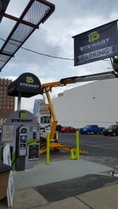
Stewart Parking Banner
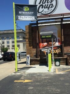
Stewart Parking Banner
The A-frame has the same purpose as the banner: to direct passersby to the parking lot. The sandwich board is double-sided, with each side holding a coroplast panel. For those not familiar with the substrate, coroplast is a corrugated plastic sheet. It is often used for real estate signs or other temporary signage. It is very lightweight and can be swapped out easily.
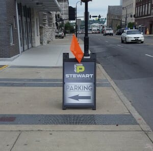
Stewart Parking sandwich board
For anyone wondering, we also created the Horton Group sandwich board located to the left of the parking meter, although this A-frame is not part of this particular installment.
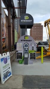
Above the parking meter is an awning, which protects the meter and its users from rain, snow and heat. The awning itself was created by Awnings Plus, a company in Murfreesboro, TN. We installed the poles and the awning cover. The custom cover was created with adhesive vinyl, which is advantageous because it conforms to irregular surfaces and is waterproof. It is a great option for outdoor signage.
Now on to the fancy parking meter signage: the meter signage and displays. The branded frame is made of max metal, a durable substrate that will hold up during tough weather conditions. Below is the test fit of the frame: a piece printed on coroplast to check the contour. As you can see, the light gray squares mark the area for the four smaller signs.
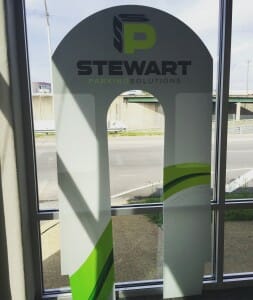
Max metal frame pre-installment
The four signs attached to the frame are made of max metal, as well. They all protrude from the frame, giving the meter signage a three-dimensional element. Three of the four are informational: the bottom two, from left to right, are information about the parking lot and the parking meter, respectively.
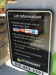
Stewart Parking Lot Information
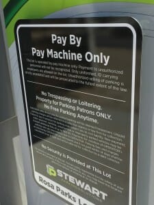
Parking Meter Information
The top two signs are the coolest part of the whole installment (in our opinion). The top left is a map showing the meter user where he or she is. We installed LED lights to make the map more dynamic (although the light isn’t turned on yet in the photo below). LED lights, or light-emitting diode lights, are optimal in consumer products because of their high switching rates. Compared to incandescent light sources, LEDs also have a lower energy consumption, longer lifetime, a smaller size and better physical robustness. They are often used in remotes or digital alarm clocks.
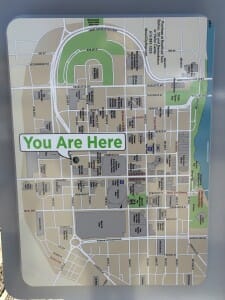
Max Metal Map
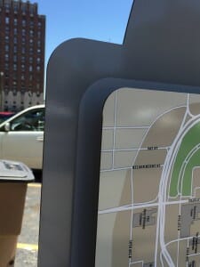
Max Metal Map
Finally, the fourth max metal sign holds hand sanitizer! How cool is that?! Obviously, parking meters get pretty gross from everyone’s hands, so Stewart Parking has done everyone a solid by making their parking meters more sanitary. Talk about competitive advantage!
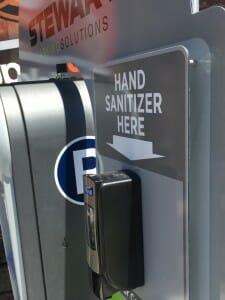
Stewart Parking Hand Sanitizer
This parking machine is located at 132 Rosa L. Parks Blvd – go check it out for yourself!
Want your own awesome print job? Contact us!
Stationery is a classic paper need for business professionals. A thoughtful note can be the difference between two qualified candidates for a job opening or two respected companies vying for the same client. It’s also a great Mother’s Day gift (wink, wink).
We love stationery so much we decided to open a subsidiary company that focuses exclusively on stationery. In classic amp fashion, the company is named after a sweet pup, Addie. Coincidentally, she is also a yellow Labrador.
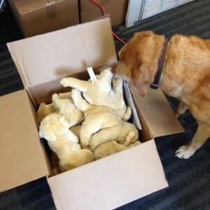
Addie with amp dogs
The company is called Dear Addie, and it produces both custom and pre-designed cards. It has its own letterpress and lovely staff members. amp still prints and designs stationery for its customers, but if you’re looking for a more specialized company, we will point you to Dear Addie.
We’ve compiled a quick list of reasons to check out Dear Addie and why stationery is so important.
Thank you notes are still a big deal in today’s digital- and smartphone-obsessed world. Presents, interviews, wedding services and nice gestures still demand thank you notes, so you might as well get some nice, personalized stationery. Thick paper and a nice design make the note more professional, meaningful and thoughtful.
Sure, you can announce something via email. But people receive hundreds of emails a day. Things get lost in the shuffle. A handwritten thank you note in a pile of bills stands out, and it’s not as likely to get overlooked. So for birth announcements, graduation announcements, moving announcements or any other significant event in your life, it’s best to send paper cards.
Paperless Post is nice for smaller events, but for weddings, 50th birthday parties and baby showers, a paper invitation is the traditional method of communication. Something physical can also be saved as a keepsake. People can’t pin a save the date email to their refrigerator. And going back to the copious amount of emails sent per day, email invitations can get lost or forgotten easily.
It’s still customary to wish your friends, family and colleagues Merry Christmas/Happy Holidays via snail mail. It takes more effort and thus is more meaningful to recipients. For businesses, it’s a good method for retaining and reconnecting with clients.
You’re going to have to write a note to a colleague at some point in your career. If it’s on nice paper and has your name/monogram on it, you look like a boss.
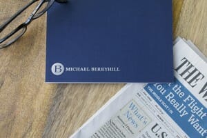
Personalized stationery
The guy who printed the cards above had his name foil stamped. It shines in the light. Does this not make you want to work with him?! Well, it should.
So check out Dear Addie. It’s awesome. And it’s a great gift for Mother’s Day (did we already say that?).
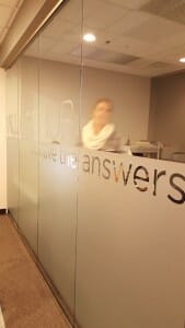
Frosted glass, or “etched glass” is a really popular graphic for businesses. Law firms, real estate companies, architecture firms, advertising agencies and other corporations like the professional, classy way to promote their logo and/or business name. It doesn’t block out the light like some window decals, but instead scatters the rays. It allows for privacy without being too closed off.
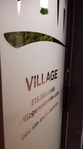
Frosted glass can be produced a few different ways. You can sandblast or acid etch clear sheet glass. As you can guess, this method requires a lot of labor and some fancy tools. We prefer to print a vinyl film and adhere it to windows or doors. As you can see from the pictures below, it looks like real etched glass!
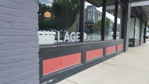
Village Real Estate loves frosted glass, so we have a lot of pictures of their various doors and windows. They have a variety of etched glass: some on doors, some on windows, some on the outside, some on the inside, some are small decorations and some cover the whole window. How you use frosted glass is a matter of style and preference. It also depends on the amount of privacy you want to maintain. For entry doors, some people prefer to cover the whole door in film.
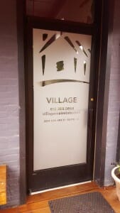
Frosted glass door
Etched glass door
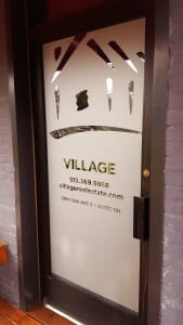
Etched glass door
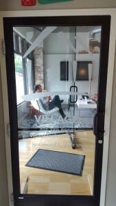
Etched glass door
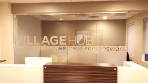
Etched glass window decal
Etched glass window
Etched glass windows

Etched glass windows
Frosted Glass for McAlpine
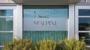
Another client that requested etched glass was McAlpine, a residential architecture and interior design partnership. Instead of covering their whole window in etched glass, they just wanted a horizontal strip across the window. It looks really pretty and clean next to the green shrubbery.
Etched glass window
Want some etched glass of your own? Give us a shout!
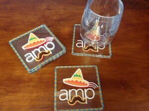
Personalized coasters are a big seller for amp right now. It’s a great branding technique and the perfect gift for birthdays, events, mother’s day (wink, wink), etc. Acrylic coasters are more popular, but we also make thick, paper-like coasters, too. The product above was made for Christy Ikner, who works for Village Real Estate. The construction image correlates perfectly with her job!
We talk about acrylic a lot, but for those who don’t know, it is a type of formed plastic. It resembles glass and looks very professional. Below are holiday coasters we created for Cinco de Mayo last year.
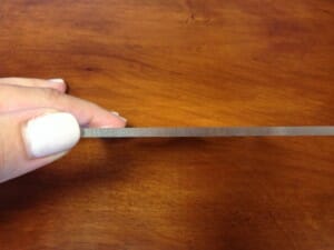
Side view
We normally create circular or square coasters, but we can make any kind of shape you desire. For Christmas, we utilized a Christmas tree and snowflake shape. You could create the shape of your logo, the shape of your pet, a coffee cup.. the options are endless.
Due to the transparent nature of acrylic, these products are usually one-sided. The exception is if you print a full picture (shown below). Normally, we print second-surface to make the image more 3-D. In other words, we print on the back side. In addition to making the image “pop,” the front surface protects the image from scratches and other damages. If you look closely, you can see the 3-D nature below.
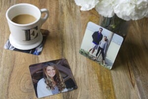
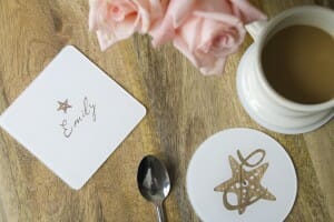
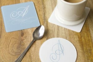
The three images above contain products created by Dear Addie, our subsidiary stationery company. They have pre-designed coasters that you can easily order through their website.
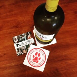
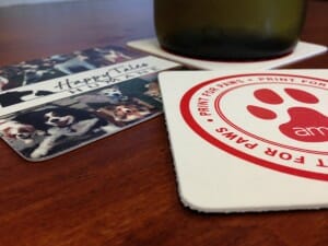
We also offer a thick, paper material, which has the advantage of being double-sided. You can see an example of the two different sides in our Print for Paws coasters. One side features the campaign logo, while the other features pictures of cute pups (our personal favorite side). Paper is nice because it is less expensive than acrylic. The flip side is it is not as durable.
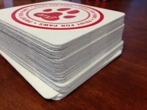
Print for Paws coasters
Want to order your own ? Get in touch with us!
Window decals are a great way to advertise your business, provide information to your customers and enhance the overall appearance of your store or company. Unlike wall decals, window decals invoke passerby curiosity and offer repeated brand exposure. As we discussed in an earlier post, these two factors are the reason signs attract up to half of all business’ customers (Brandon Gaille).
In addition to promotion, window decals are great because they offer information, such as hours of operation. You could use a sign to deliver this info, but signs can deteriorate with everyday use (if they aren’t well-made) and they can get in the way. A window decal looks classy and professional.
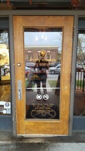
Lucky for us, Frothy Monkey wanted to amp up their window/door graphics at four Nashville locations: East Nashville, downtown Nashville, 12 South and Franklin.
At the Frothy Monkey Bakery in East Nashville (at the Shoppes on Fatherland), we added orange and white window decals to two doors. The orange decal is printed on permanent adhesive 3m IJ180 w/ 8518 overlaminate and the white decals are simple cut vinyl. We used these two substrates for all Frothy Monkey windows.
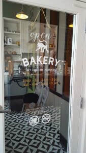
Frothy Monkey Bakery Window Decal
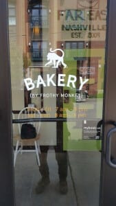
Frothy Monkey Bakery Window Decal
For the downtown location, we used the orange decals exclusively. We also printed a pretty cool sandwich board (3rd picture) that will attract even more customers.
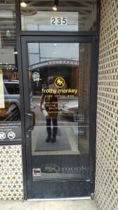
Frothy Monkey Downtown Window Decal
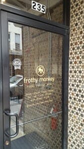
Frothy Monkey Downtown Window Decal
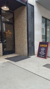
Frothy Monkey Downtown Window Decal and Sandwich Board
For Frothy Monkey’s 12 South location, the original Frothy, we used both orange and white decals on all three doors. The white information really pops next to the orange.
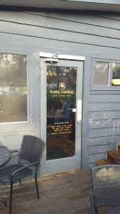
Frothy Monkey 12 South Window Decal
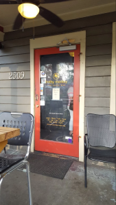
Frothy Monkey 12 South Window Decal
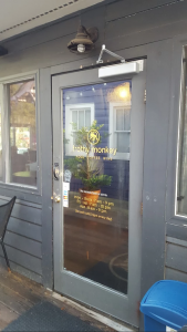
Frothy Monkey 12 South Window Decal
Finally, for Frothy Monkey’s downtown Franklin location, we printed both orange and white decals.
Frothy Monkey Franklin Window Decal
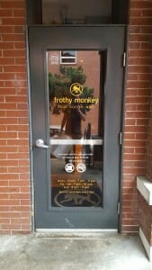
Frothy Monkey Franklin Window Decal
All in all, we think these window decals turned out pretty awesome. If you’d like to see other examples of window or door graphics, check out our projects with Village Real Estate or EO Nashville.
Everyone’s always looking for awesome business cards to make their company stand out and their brand memorable. As we’ve stated in a previous blog, 10 billion business cards are printed in the U.S. each year. Eighty-eight percent of these business cards handed out will be thrown away in less than a week. Thus, your business card must be unique or is it just one in a billion. Literally.
This company did a darn good job making their business cards stand out. Specifically, they incorporated two techniques to make their business cards different: die cutting and edge painting.
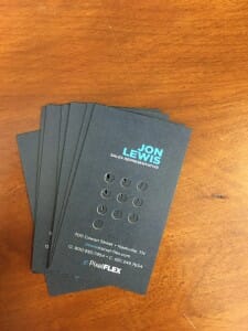
Die cut business cards
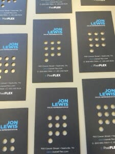
Die cut business cards
First, let’s go over the die cutting. This customer is a company that provides LED display technology. In other words, they provide digital displays to jazz up concerts, shops and other venues. Their logo, 10 dots in three columns, is a symbol of the displays they offer. Naturally, they wanted business cards that showcase their logo and represent the type of product they provide. They could have just printed their logo, but instead they made a die cut of their signature. As you can see above, their logo was actually cut out of the square card. How neat is that?!
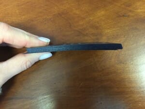
Edge-painted business cards
Our client could have stopped there, but they thought their awesome business cards needed another touch of cool: edge painting. Blue and black are the company’s colors, so they added a shimmery, navy paint around the edge of each card. There is just enough shimmer that it catches the light but isn’t too flashy.
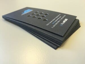
Edge-painted business cards
We love how innovative our customers can be. Do you have any cool ideas for business cards? We’d be happy to help!
Car decals are a great form of advertisement. According to the American Trucking Associations, vehicle ads generate more than 600 visual impressions for every mile driven. Instead of paying for multiple billboard locations, just purchase one car decal and take your ad wherever you go!
We print decals for just about any vehicle, including cars, food trucks, vans, jeeps and gators. We always use vinyl and apply a laminate to protect it from various weather conditions.
The decal below is a typical vehicle ad. It features the name of the company in large letters and includes services, a phone number and a catchy phrase or motto. We created four separate decals for this particular company: two adhesives for the sides of the van and two adhesives for the back windows. They were cut to contour the windows after application (not shown).
Window decals are popular because they are easy to make and easily visible. In the video below, Brook applies the vinyl decals. We adhered them on a windy day, so Brook had a harder time than normal! Poor guy. He did a stellar job, regardless.
Our next decals showcased are for a food truck called “Off the Wagon.” This client wanted circular decals because their logo is circular. The vinyl decal blended right in with the truck — it looks like it was painted on!
Off the Wagon wanted a couple different sizes. The one below was just a tad bigger than Brook.
These adhesives, like all our other car decals, are printed on our VUTEk machine and cut on our Colex.
Finally, a car decal for our very own gator. Despite appearances, it is not a vehicle wrap. But you’d never know the difference because our car decals are so slick!
High-fives for awesome car decals!
Contact us if you’d like to order your own car decal.
It’s about time we wrote about our popular, new lexan business cards. We receive more compliments on these business cards than most of our other print collateral (which is hard to do, seeing how we print such awesome things). If you’ve never heard the term before, lexan is a type of plastic. It’s desirable because of its durability, versatility and professional appearance. There are also no-glare versions, which can be nice for outdoor signage or ornaments.
We talk about its sister substrate, acrylic, a lot, especially in terms of signage. We’ve created storefront signs, trade show signs, wall art, inner-office signs, wedding signage, coasters, ornaments and easels out of the material. Now, we are going to talk about business cards.
Every lexan business card we’ve printed has included white ink. Our new VUTEk machine can print white ink, a rare printing capability, and lexan is an especially good substrate to show off the unique service. There are various trims to choose from, just like paper business cards. Dear Addie chose half square, half rounded.
SOAR Adventure and Parks Realty both chose a round trim, which looks classy and removes potential sharp edges.
To print your own, hit us up! PS: If you can’t remember the term, just ask us about our “plastic” business cards. We know what you mean.We’ve mentioned that we can put stickers on just about anything.. but I bet you didn’t think about sticker stencils on eggs! For Easter and springtime festivities, Reed PR wanted to dye eggs with their logo as the main design. To do this, we created a sticker stencil for them (in print language, “adhesive vinyl”) to place on each egg they wanted dyed.
The sticker itself was teensy, tiny. It was attached to each egg, dunked in dye, allowed to dry and then peeled off — which is what left the white outline of the Reed PR logo. Adhesive vinyl is great because it simultaneously sticks and peels off easily. As you can see from the photo, the stencil held well enough to not let any dye seep through the edges, but it didn’t damage the egg when it was removed. That dual capability of adhesive vinyl — to be sticky but not too sticky — is what makes the substrate so appealing.
We use adhesive vinyl on many other surfaces, including walls and windows. It’s becoming one of the most common ways to decorate homes because it is easy to cut, self-adhere and remove. It lasts for about 3 years and can be removed easily and cleanly for up to two years after application. Its matte surface prevents glare and appears to blend in seamlessly with the surface it adheres to. On walls, we’ve had clients request images, quotes, maps, company slogans, company values — and most commonly — the company name or logo. On windows, we usually create clings to promote events or temporary deals or offerings. We even have double-sided wall clings which can advertise to folks inside and outside the building. Double the cling, double the impression! See an example in this post, where we created double-sided wall clings for The Cosmetic Market. The project is toward the end of the blog.
Need some sticker stencils or adhesive vinyl in your life? Give us a shout!
Little Mosko’s has combined two of our favorite things: awesome food and cool wall decals. The “muncheonette” and bake shop, located in the Entrepreneur Center, did a little redecorating this past week, and now they house two wall decals, a hanging sign and a sandwich board.
The wall decals are made of adhesive vinyl. We know, it looks like it was masterfully painted on the walls, but alas, it is just a super rad sticker. We used a vinyl with a matte finish (as opposed to a gloss finish) to avoid glares or hotspots from interior lighting. For the adhesive, we opted for a less permanent version to avoid damaging the walls if Little Mosko’s wants to remove the decal in the future. Don’t you just love the decal that reads “Coffee. Breakfast. Lunch. Munch.”? We may have to munch there for lunch today..
Moving on to the hanging sign, this bad boy was created using PVC. Also known as polyvinyl chloride, PVC is a commonly-used type of plastic. It is used instead of metal and glass because it is more lightweight, more cost effective, resistant to weathering or chemical rotting, and easy to install. It is very durable and has the dual advantage of being non-toxic. It’s a safe material that has been researched and tested more than any other plastic in the world. Plus, it looks cool.
Last but not least, we created a sandwich board for the eatery with two coroplast panels. For those not familiar with the substrate, coroplast is a corrugated plastic sheet. It is often used for real estate signs or other temporary signage. It is very lightweight and can be swapped out easily.
Little Mosko’s, you done good. Time for lunch.
This past weekend we created our first hop-up banner for Dear Addie Fine Stationery. A hop-up banner is used instead of a normal banner for its size and rigid frame. It is similar to a stand-up banner in that the graphic doesn’t move, but on a much larger scale.
Dear Addie initially wanted a wooden frame as the backdrop of their booth. However, a wooden block is heavy, difficult to move and expensive. A more feasible option was a hop-up banner. That way, Dear Addie only needed an image of a wooden backdrop instead of the real deal. The end result looked very realistic and received lots of compliments at the show.
This type of banner includes a lightweight (silver, in our case) frame that collapses to a fraction of its size when it’s not being used. Despite its lightweight nature, the frame is extra strengthened to support such a large image. We printed four separate panels of the image on our VUTEk machine and attached them to the frame with magnets. We printed on 3 mil. styrene, a lightweight material that can be easily transported.
To make their booth stand out more, Dear Addie wanted their logo attached on top of the wooden image. To do this, we had to use a lightweight substrate to prevent the frame from collapsing. We decided to print on lexan, a type of formed plastic similar to acrylic, and screwed the logo to the image with silver standoffs.
Originally, Dear Addie went with a clear logo, which is what you see in the image above. However, the same standoffs were used on the green. The stationery company ultimately decided on green because the color was more distinctive, the logo more legible and the sign more noticeable.
To make their booth even cooler, Dear Addie had a contest for a lucky bride to win a free wedding stationery suite. The company advertised this competition with a chalkboard sign, also printed on our VUTEk.
This isn’t the first time Dear Addie has used a chalkboard sign, as we discussed in a previous blog.
We are really excited about the potential of hop-up banners for the rest of our clientele. If you’d like a hop-up banner of your own or would like to rent the silver frame, please get in touch.
A popular request lately has been storefront signs — specifically, acrylic and max metal storefront signs. It’s a really pretty, noticeable way to brand your building or shop, advertise your company, and increase brand recognition and exposure.
The two storefront signs we’re going to discuss were printed for Cognito Hair Design and Dear Addie Fine Stationery.
Although they look similar, Dear Addie was created with acrylic while Cognito was printed with max metal.
Dear Addie, specifically, was created using two acrylic layers: one for the background and one for the words “Dear Addie” and the logo.
Although it’s a little bit difficult to see, if you look closely, you can see the raised “Dear Addie” letters on the storefront sign.
To install the sign, we used silver standoffs. You may remember standoffs from our posts on Third Man Records or Lendlease. For Third Man, we used black; for Lendlease, we used silver. There are various colors, and you choose based off the color scheme of your sign or art installation.
In the two pictures below, you can see the holes where the standoffs would be placed (there are four).
Standoffs are one of the most popular ways to mount signs because of the way they look. They tend to blend into the sign itself and are typically not that noticeable, unlike screws.
Screws are actually what we used to mount Cognito’s sign. Specifically, we used tapcons, a type of masonry screw.
We also used custom spacers behind the signs to make the sign stand out from the wall. The spacers were 2.5 inches.
In the pictures above you can better see the max metal layers of the sign. Like Dear Addie’s sign, we used two layers: one for the background, one for “Cognito.” If you click on the picture above you can see the raised letters.
Finally, we created custom fittings to go on the heads of the screws to make it look like the storefront sign is mounted with silver standoffs.
The reason for this is because standoffs look much nicer than screws. Unless you’re going for a heavy-duty industrial look, you want to go with standoffs. It looks much cleaner and professional.
On a side note, we also created etched glass designs for Cognito’s windows, as you can see in the pictures below.
It was a nice touch and complements the storefront sign without being too showy.
Want to create a storefront sign of your own? Let us know!
We love printing where no printer has printed before. GS&F helped us expand our resume by asking us to brand some tables for them. How did we get these large pieces of wood in the printer, you ask?
Well, they didn’t go in the printer. We actually printed a large adhesive vinyl which we then attached to the tables. We printed the vinyl on our new VUTEk machine, and we cut it using our Colex.
GS&F provided us with the tables they wanted, and we took care of the design. As we’ve said before, our new vinyl adhesives can brand just about anything. We’ve branded chairs, coolers, guitars, hard helmets and beer taps. Basically, if you can think it, we can print it. We like to stick by our motto “making the impossible possible.”
The tabletop prints looked amazing, as you can see below (it helped having some good looking folks in the photo!). We believe they installed the tables in their office, which really brightens up the room and strengthens GS&F’s brand. When employees are working, they see the brand. When visitors sit to have coffee, they see the brand. As any good advertiser knows, a message is most effective when repeated. So by splashing GS&F’s logo all over the office, the company is reinforcing in client and employee minds the values and characteristics GS&F represents.
GS&F is known for its creative prowess in Nashville. We’ve printed with them for a while now, and they always give us some neat ideas. A few months ago they wanted some edge-painted business cards, which we featured on our blog, and now they’ve blown our minds again.
Do you have something cool and unique you’d like to print? Let us know! We’d love to help.
Metal signs are nice because of their durability and their chic look. Whether you have an outdoors max metal “For Sale” sign or a wall print for your office, the substrate will be perfect for any realtor’s need.
Plus, the substrate looks really nice in the light!
If you want to get really fancy, you can create a 3D max metal sign, as Lendlease did. They are not a real estate company, but they are our first client to use the printing technique.
A basic need for any realtor. Corrugated signs and directional arrows are an effective and affordable way to advertise and guide potential buyers. Corrugated material is useful because it is waterproof and meant for extended outdoor exposure. We use inks that won’t fade in the sunlight.
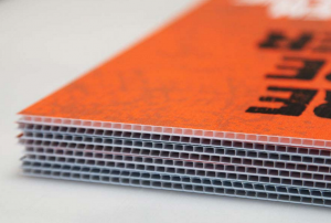
Corrugated sign — we did NOT print this. Just for a visual
Another staple for a realtor. Open house signs can come in many different forms: banners, foamboard, corrugated plastic, max metal, acrylic.. the list goes on. The open house sign below is unique because of its shape. With our new Colex machine, we can die cut wide-format items into any shape you desire.
Again, a staple. Banners are another affordable and effective medium for advertising — both indoors and outdoors. Stand-up banners are nice because they are easy to roll-up and transport, and they also don’t do any damage to your walls. Set-up time is faster and easier than traditional banners.
Signs can be made of banner material. The banner below is held up with metal stakes and grommets. This banner is made of vinyl, which is very weather-durable.
Mesh is another great substrate for banners. It does particularly well in windy situations: its small holes allow air to move through the banner without damaging it.
Etched glass is one of our favorites. It’s a great way to advertise without being too flashy. It looks very classy and professional. It also doesn’t take up any extra space since it utilizes the architecture available.
A similar look to etched glass, wall graphics are also great for real estate firms. It is a little more noticeable than etched glass, but still saves valuable space.
Wall murals are a really nice touch to offices. Advertise a gorgeous shot of one of your buildings — visitors and potential buyers won’t be able to say no!
Window clings are nice because they are more temporary. They are perfect for advertising events or announcements. The cling below is actually double-sided, which allows for advertising on the inside of the store as well as to passersby on the street.
Another one of our favorites. Acrylic is a really nice, durable material. It’s not too flashy and shows you care about appearances — an important trait for realtors.
Like max metal, acrylic looks really neat in the light! Thanks to our new VUTEk machine, we can print white ink on acrylic — a really nice touch to the product.
A really pretty substrate for wall art. It is easier to transport than max metal and acrylic.
Less fun to discuss than wide-format, but still essential for realtors and real estate firms. You need to be able to advertise and inform on-the-go, which is where booklets and brochures come in. Leave customers with a tangible and long-lasting impression.
A nice touch for any company that emphasizes repeat brand exposure.
Last but not least — business cards. Gotta have cool business cards to stick out. Below are three unique examples that few people have seen.
Got any questions? Don’t hesitate to ask! We’d love to help you get started on your printing today.
Chalkboard printing is one of our new favorite services. People rarely think to print on the substrate, so you rarely see it with a printed design. It really stops a passerby in his or her tracks. You can see the wheels turning as he or she studies the object: “Is that chalkboard? No, couldn’t be. It looks like someone printed on it. No, that is chalkboard. I didn’t know you could do that!”
We create this product using our new Vutek machine, which can print on almost any rigid substrate that is 2″ thick or less. It can also print white ink, another rare printing service. We’ve had a couple clients experiment with chalkboard printing in the past month or so, and the results are nothing short of awesome.
Emily Holmes, a local designer who specializes in stationery, envisioned a chalkboard wedding sign with white ink only.
We’re not sure the theme of this particular wedding, but this chalkboard sign would be especially nice for a black-and-white wedding. It’s thicker than regular poster board and looks much more formal. It’s also quite unique for weddings. Some clients request acrylic signs, but no one thinks about chalkboard.
White ink on chalkboard will look great at any event or location, as the colors go with everything, but if you’re looking for something less formal and more colorful, we can also print other colors.
The sign above was used at a holiday expo event. Dear Addie, also a stationery company, wanted a display that was eye-catching, memorable and one-of-a-kind. So we recommended chalkboard.
The sign ended up looking great. It really stood out next to their table, which was covered with white tablecloth. They received a lot of compliments on the chalkboard, especially that it made the display look more “fun.”
Want to print a chalkboard sign yourself? Or just want to take a tour of the machine and see its capabilities? Get in touch with us!
On Tuesday, we discussed the difference between bunting banners (a.k.a. letter banners) and traditional banners. To recap, a bunting is a collection of flags considered as a group. They are usually used for festive decorations, and many times letters are printed on each flag to spell out a name or phrase. They take less effort to hang than traditional banners, which is why they are used for more temporary occasions, like parties.
Edley’s BBQ ordered a bunting banner for a bridal show in which they showcased samples of their food. In the more close-up photo below, you can see that Edley’s chose triangular flags, a classic shape for bunting banners.
We used kraft paper for the flags, which is a really nice material for this project. It’s a little bit nicer than the material we used for this wedding (below), where we used vinyl.
Of course, it’s hard to determine the material in a photograph after the flags have been printed. We cut each flag by hand as it was too big for the letterpress. We ran the job on our HP Indigo.
So why would Edley’s prefer a bunting banner over a traditional banner? Well, for one, it just depends on the buyer’s preferred style. However, we think that sometimes bunting banners look a little prettier and a little fancier. It was also a one-day show; hauling a traditional banner and hanging it up would have been a lot of effort for such a short amount of display time. It appears it might also have been a little heavy for the curtains, as well. A bunting banner is less material, and thus more lightweight.
Edley’s also printed a stand-up banner, which is great for displays since it doesn’t require any hanging.
Another benefit of stand-up banners is that they are easy to roll-up and transport.
Seeing the display in full, a traditional banner would have clashed with the stand-up banner. The letter banner complements the display without overdoing it.
Want to learn more about letter banners? Check out this post.
Want to create a bunting banner of your own? Email us!
Recently, we created our first acrylic easel for Village Real Estate. It’s not our first easel — we’ve created adhesive, self-stick easels out of chip board in the past, but this new acrylic easel is much sturdier.
As you can see above, the self-stick easel is easy to use and easy to transport. However, it would not hold a particularly heavy object. It is best for smaller pieces, such as a flyer or a lightweight picture.
The acrylic easel can hold larger objects, and it looks more professional. The transparency allows the easel to coordinate with most interior decorations, as well.
To create the acrylic easel, we used our Colex machine to cut (route) the product and a heat vendor to shape it. When we first cut the acrylic, the easel shape lies flat. We use the heat vendor to mold it to that nice 90 degree angle.
As you can see below, it is sturdy enough to hold large, heavy photos or posters.
Village preferred a tall easel back with relatively short legs, but we can create any shape you want. For instance, if you wanted a smaller back, that would be very doable.
This is just one of the many cool projects we’ve done for Village. To see some of our other work for the real estate firm, check out this post.
Please let us know if you’d like a quote on this easel or if you have any other questions!
We love Christmas cards — the thoughtfulness, the design, the meaning behind it. However, we don’t love the waste it produces, which is why we encourage our customers to recycle their cards after Christmas. For the past eight years, customers have brought in between 20,000 to 30,000 cards. This year, we are also prepared to pick up holiday cards from local corporations if they will gather unwanted cards beforehand.
We are also excited to team up with Dear Addie Fine Stationery in an attempt to recycle even more cards. We are calling this initiative “Deck the Halls with Recycled Cards.” The goal? To recycle 50,000 cards during the month of January.
For some jolly good fun, here are a few facts about card and packaging production in the United States.
If those facts don’t make you want to recycle, we’re not sure what will. So let’s get started! Below are 8 tips to help you stay on top of your waste this year.
1. Cards with glitter, foil, vinyl overlays, foil-lined envelopes or plastic cannot be recycled
2. Dark envelopes and brightly-colored envelopes are also off-limits. Pastel colors and variations of white are ok.
3. Photos and photo paper are not recyclable.
4. Remove the handle of gift bags if it is not made from paper, including string.
5. Remove ribbons, bows, metal/Mylar tissue and metal/Mylar shreds from packaging before recycling.
6. Ensure there are no traces of food.
7. Make sure all packaging is dry and clean. Bags must be empty. Remove all tape!
8. Reuse your cards and packaging for the holidays next year. Examples below.
Cut cards into tags, punch a hole, add ribbon, and voila! You have yourself a unique holiday gift tag. Found on marthastewart.com
Another goodie from Martha Stewart. Glue cards onto cardboard boxes to spice up your gifts.
Adorn next year’s tree with old holiday cards from friends and family. Saves money on Christmas decorations, too! Found on Better Homes & Gardens.
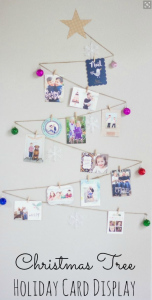
Finally, there are numerous Christmas card displays that you can create from your cards. Found on designimprovised.com.
For 12 awesome displays, check out this blog.
“What are your wide-format capabilities?” We get this question a lot. It’s difficult to answer because there are so many. Essentially, if you can think it, we can print it. However, for those who need more specifics, we’ve created a non-exhaustive list of our wide-format capabilities broken down into seven categories: architectural graphics; die cut signs and stand ups; regulatory and site signage; vinyl decals; stretch canvas; indoor and outdoor banners; and trade show materials.
If nothing else, we hope this blog post gives you some ideas for wide-format products in your future!
This is the broadest category, including wall, window, floor, ceiling and pavement graphics; digitally-printed menu boards; and acrylic displays.
As opposed to traditional advertising, architectural graphics are instant, inexpensive and flexible. Outside pavement and window graphics are cost-effective methods of advertising and invoking curiosity in passersby. In your lobby, enable customers to learn distinguishing characteristics about your business with wall graphics: what do you like; what do you stand for?
This includes metal signs, foamboard signs and custom shape cutouts. The main benefit of a die cut is its unique visual appeal. A fun shape will have a lingering impression on the viewer, making you or your company stand out. We can create cutouts as large as 4 x 8 feet and on various materials such as foam, Gator Board, wood, acrylic and aluminum, thanks to our Colex Flatbed Router.
This includes real estate, commercial, job site and yard signs. This type of signage is ideal for direction and explanation. It can be used to mark off a section for construction, lead someone to an event or business location or let neighbors know a house is for sale. Let this sign speak for you when you cannot.
4. Vinyl Decals
We can’t do car wraps, but we can create vinyl decals such as the ones below.
Instead of paying for multiple billboard locations, purchase a car decal and take your ad wherever you go. Vehicle ads generate more than 600 visual impressions for every mile driven, according to the American Trucking Association. amp measures specifically for your vehicle and will adhere the decal free of charge.
5. Stretch Canvas
With our stretch canvas capabilities, you can now have your digital photos of favorite artwork on your living room, bedroom or office wall.
What most people think of when they think of wide-format. This includes vinyl, mesh, promotional and building banners.
Materials include blow-through, mesh, matte scrim, multi-purpose vinyl and other substances. We can create banners up to 150 feet in size.
This includes banner stands, pop-up displays, backlit displays, easel signs, folding tabletop displays, backdrops (step and repeat is a popular choice), and cutouts.
Trade show materials are easy to move and store. It is ready to travel and represent your brand in an eye-catching and engaging manner to potential new customers.
Can you think of any wide-format capabilities we’ve forgotten? Have a question? Let us know!
With Thanksgiving right around the corner, we thought it would be a good idea to compile a list of printing capabilities, print products and other things to be thankful for. We’ve thrown in a side dish of these things we, in particular, are grateful for!

What if you had to design your own holiday card every year?! What a nightmare. Luckily, there is a cornucopia of ready-made holiday cards out there. Visit our collection here.
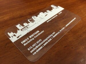
Gone are the days of boring business cards. Today, you can print on things such as acrylic AND include white ink thanks to machines like our VUTEk.
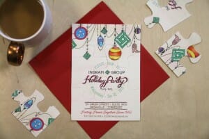
An invitation you can also play with?! Designed by the Ingram Group.
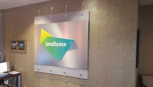
You can literally make your signs stand out now. Read more about this project with Lendlease here.
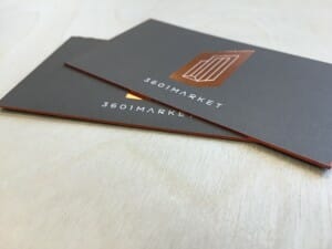
Ok, so foil stamping and edge-painting has been around for a while, but it’s still cool.
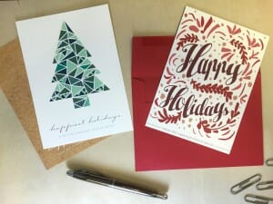
It can be a pain in the a** to write out 103 addresses on different envelopes. Luckily, there is now a way to print different addresses on envelopes using an excel sheet. Some print shops (like us) can also stamp and mail out your cards, too. Trust us, this saves a lot of time.
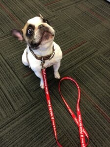
Ok, so this is something we’re thankful for. This cute guy is Meatball with Harbor Entertainment. You can still purchase a Print for Paws leash here and help pups and cats at Happy Tales Humane.
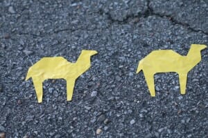
This printing technique is new for us thanks to our VUTEk and Colex machines. These camels are for our awesome friends at CJ Advertising.
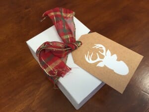
Because, how annoying would it be to include a card with every gift? And try to stuff it in tiny boxes like this one above? Shop ready-made holiday hangtags here.
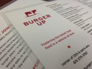
They’re soft, and they are waterproof. Win win for customers and servers. Menus courtesy of Burger Up.
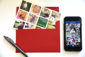
You can now print your awesome Instagram pictures and put them straight on your holiday card. This card is designed by Emily Holmes. Order it and others here.

We’ve had our letterpress for a while, but thanks to our new Colex, we can print large die cuts like the one shown above. Kelly’s thought bubble reads: “I love my job.” And yes, we’re thankful for Kelly, too, because she’s an all-star customer service rep.
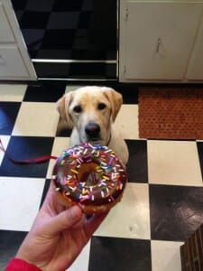
Because… they’re delicious?
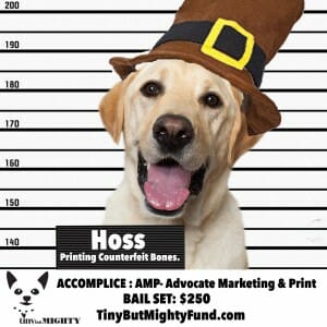
Another one for us, in particular, to be grateful for. These special friends are simultaneously helping homeless pups and cats at the Nashville Humane Association. We’re also thankful for the Tiny But Mighty Fund that put together “Nashville’s Most Wanted” campaign. Help bail Hoss out here.
Not to sound cheesy, but we’re grateful for our awesome customers most of all. Thank you!
Now, where’s that turkey?!
Ahh, the dreaded family holiday photo!
No, taking photos for holiday cards is not everyone’s favorite thing to do. However, with these 6 holiday photo card tips, you can make your photo shoot quicker and more enjoyable — and your card prettier!
Most families are busy, and many children don’t enjoy taking photos. Give everyone enough time to prepare and look nice. If you have young kids, think about taking your photos in the morning when your kids are more awake. If your kids tend to be grouchy in the morning, take one in the late afternoon.
The main focus of your holiday card should be your family — not the background. Make sure furniture and home décor is at a minimum and the setting is clean and tidy. If you take a photo in front of the Christmas tree, ensure a good distance between your family and the tree. If everyone is too close, the camera will focus on the tree and not your lovely faces.
We love outdoor settings. It looks very natural, and psychologically, humans prefer open spaces. We are hardwired to look for this setting because — back in our primitive days — it allowed us to spot any predator or threat (Side note: this is why medical advertisements always feature a patient on the beach or in a field of flowers; it automatically puts the viewer at ease). The best locations are clutter-free, such as walls, fences, parks or the beach. Be sure to include lots of sky, grass or pavement if you would like to add text or design overlay.
BONUS POINT: If you want a card that is ultra seasonal, take your photo at a tree farm or on a field of snow.
Just after sunrise and before sunset are the best times for photo shoots. The lighting will be more consistent and not too bright. Avoid direct sunlight if you are outside and find some shade. However, don’t use too much shade as that will create too many shadows and a patchy photograph.
If you are inside, take photos near windows. Natural light always looks the prettiest, so turn off any artificial lights to avoid messing up the sunlight or casting an unflattering view.
Like your background, your clothes need to be neutral so as not to distract from your faces. As a general rule, avoid patterns unless it is subtle and neutral-toned. One exception is flannel, as this pattern is seasonal.
Whatever apparel you choose, just ensure everyone is dressed similarly.
A good photographer takes lots of photos. It is rare that you will have your best picture on the first try. Try switching up positions, orientations and zoom level. Mix up who’s in each shot. Take a photo of each child individually, parents together and parents with each child. If for some reason no one can agree on a full-family photo, you will have alternatives to create a photo collage card.
Although you will want to take some close-ups, it’s best to take most photos a little zoomed-out. This allows for cropping in case your photo card requires certain dimensions.
You don’t want to look too stiff or too posed. If you are not having a professional take your photos, ask a friend that your spouse (and kids) feel comfortable with. Think of a few jokes to tell when everyone gets tired. If your pet is in the photo, have some treats on hand. If your pet isn’t in the photo, allow him or her to be nearby so that he or she can interact with your family between shots.
Sometimes, the best times to get relaxed pictures of your family are when they are not looking. Have the camera ready to take some awesome candid shots.
Have the photo, but need a design? Check these out.
Still hate taking family photos? Check out our non-photo holiday cards.
For more holiday card inspiration, check out our Pinterest.
This year we are offering something special: a set of ready-made business holiday cards that you can customize and order today. Click on each card for more information, and email order@advocateprinting.net with any additional questions/orders.
Our standard turnaround time is 2 business days. Our quantity offerings start at 25 and increase by multiples of 25. Please give her 1) the name of the business holiday card 2) the quantity 3) the color 4) your name/family name(s) 5) if you want pick-up or delivery 6) any verbiage you’d like to change or add 7) trim 8) paper type and 9) due date.
Our house papers include uncoated, gloss, matte, linen, felt and kraft. We can order specialty paper if you would like it.
The different trim options include square (standard, no extra cost), rounded corners, scalloped, geometric and quatrefoil.
Every card comes with a standard, cougar white envelope. If you’d like a specialty envelope, we can order that for you. We can print your return addresses and each recipient address if you send us an excel sheet with recipient name, address, city, state and zip code. It should be in that order in five columns.
We can also stamp each card for you. If you have any questions, again, please email order@advocateprinting.net.
This year we are offering something special: a set of ready-made holiday thank you cards that you can customize and order today. Click on each card for more information, and email order@advocateprinting.net with any additional questions/orders.
Our standard turnaround time is 2 business days. Our quantity offerings start at 25 and increase by multiples of 25. Please give her 1) the name of the holiday thank you card 2) the quantity 3) the color 4) your name/family name(s) 5) if you want pick-up or delivery 6) any verbiage you’d like to change or add 7) paper type and 18) due date.
Our house papers include uncoated, gloss, matte, linen, felt and kraft. We can order specialty paper if you would like it.
All holiday thank you cards come with a standard, cougar white envelope. If you’d like a specialty envelope, we can order that for you. We can print your return addresses and each recipient address if you send us an excel sheet with recipient name, address, city, state and zip code. It should be in that order in five columns.
We can also stamp each card for you. If you have any questions, again, please email order@advocateprinting.net.
For the first time, we are offering ready-made, non-photo holiday cards that can be customized and ordered today. Click on each card for more information, and email order@advocateprinting.net with any additional questions/orders.
Our standard turnaround time is 2 business days. Our quantity offerings start at 25 and increase by multiples of 25. Please give her 1) the name of the non-photo holiday card 2) the quantity 3) the color 4) your name/family name(s) 5) if you want pick-up or delivery 6) any verbiage you’d like to change or add 7) paper type and 18) due date.
Our house papers include uncoated, gloss, matte, linen, felt and kraft. We can order specialty paper if you would like it.
All non-photo holiday cards come with a standard, cougar white envelope. If you’d like a specialty envelope, we can order that for you. We can print your return addresses and each recipient address if you send us an excel sheet with recipient name, address, city, state and zip code. It should be in that order in five columns.
We can also stamp each card for you. If you have any questions, again, please email order@advocateprinting.net.
For the first time, we are offering ready-made holiday photo cards that can be customized and ordered today. Click on each card for more information, and email order@advocateprinting.net with any additional questions/orders.
Our standard turnaround time is 2 b usiness days. Our quantity offerings start at 25 and increase by multiples of 25. Please give her 1) the name of the holiday photo card 2) the quantity 3) the color 4) your name/family name(s) 5) if you want pick-up or delivery 6) any verbiage you’d like to change or add 7) a photo in jpeg format 8) trim 9) paper type and 10) due date.
Our house papers include uncoated, gloss, matte, linen, felt and kraft. We can order specialty paper if you would like it.
The different trim options include square (standard, no extra cost), rounded corners, scalloped, geometric and quatrefoil.
Every card comes with a standard, cougar white envelope. If you’d like a specialty envelope, we can order that for you. We can print your return addresses and each recipient address if you send us an excel sheet with recipient name, address, city, state and zip code. It should be in that order in five columns.
We can also stamp each card for you. If you have any questions, again, please email order@advocateprinting.net.
For the first time, we are offering ready-made holiday hangtags that can be customized and ordered today. Click on each hangtag for more information, and email order@advocateprinting.net with any additional questions/orders.
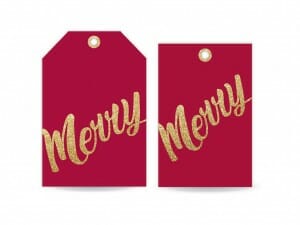
Merry Sparkle Hangtag
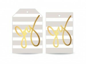
Holiday Joy Hangtag
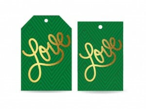
Holiday Love Hangtag
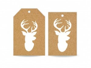
Kraft Deer Head Hangtag
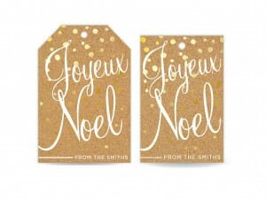
Kraft Joyeux Noel Hangtag
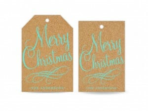
Kraft Merry Christmas Hangtag
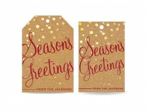
Kraft Season’s Greetings Hangtag
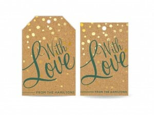
Kraft With Love Hangtag
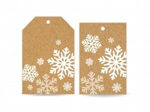
Kraft Snowflake Hangtag
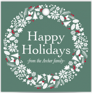
Holiday Wreath Frame Hangtag
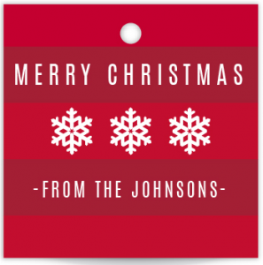
Holiday Striped
Holiday Vintage Icons Hangtag Set
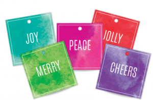
Watercolor Hangtag Set
Our standard turnaround time is 2 business days. Our quantity offerings start at 25 and increase by multiples of 25. Please let her know 1) the name of the hangtag 2) the quantity 3) the color (if applicable) 4) your name (if applicable) 5) if you want pick-up or delivery and 6) paper type.
Our house papers include uncoated, gloss, matte, linen, felt and kraft. We can order specialty paper if you would like it.
This year we are offering something special: a set of ready-made holiday cards and hangtags that you can order today. As a print and graphic design firm, this is abnormal and very rare for us. However, we are always looking for ways to make our customers’ lives easier, and we thought ordering holiday cards that are already designed would be a nice addition to our products and services.
In accordance with amp tradition, most everything you see is customizable: the trim, the verbiage, paper type, the photo(s) and, of course, the quantity. Most tweaks are doable, so let us know what you would like, and we will be happy to accommodate.
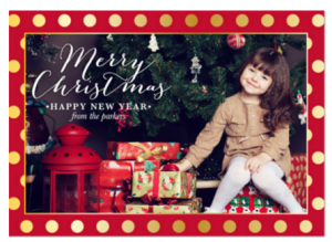
Click on each category to discover more holiday stationery awesomeness. If you want to order something or have a question, please email order@advocateprinting.net.
A couple weeks ago, we created our first — drum roll please — 3D sign. Well, technically, two 3D signs. One was a smaller version of the other.
The signs were created for Lendlease, a property group specializing in project management and construction, real estate investment and development. We used max metal as the base of the sign and acrylic for the logo’s layers and words. We did not install the frosted acrylic (above) to which the signs were attached, although it looks very cool with the max metal art.
Although the word “3D” sounds intimidating, the production of these signs was relatively simple and straightforward.
The first thing we had to do was print the max metal base. We used our VUTEk machine to do this, as it can print on most rigid substances up to 2″ thick. We printed an outline of the Lendlease logo to ensure Brook (our wide-format printing whiz) placed the acrylic parts in the exact right place.
If you look closely, you can see the shavings from the routing (cutting) process. We use a 90% alcohol mixture to clean all of our substrates before and after printing/routing. The exception is a full-print bleed — that kind of print is cleaned with plain, old Windex!
After the base has been cut and cleaned to perfection, it’s time to focus on the 3 layers of the Lendlease logo. This picture was taken after the acrylic pieces had been printed and cut. Like the base, the 3 layers were printed on our VUTEk and routed on our Colex machine.
Something cool to note about the three layers of the logo? They are second-surface printed. This means that they were printed on the opposite side from which the product was intended to be viewed. If this is Greek to you, check out the diagram below provided by blog.smartpress.com.
The reason for this is to create a more transparent logo, which in turn creates a more apparent three-dimensional object.
Once we’ve attached the three pieces of the logo, the third step is to add the letters. The blue mask you see Brook removing is a protective film. It is applied to the acrylic before it is sent to the Colex.
The final step of the 3D sign creation process is to attach the standoffs. You may remember standoffs from our blog post on Third Man Records. For them, we used black standoffs to match their black max metal prints. For Lendlease, we used silver to match their silver base.
After that… voila! The signs are complete and looking awesome.
Christmas cards can be beautiful without spending a fortune. Here are nine tips to ensure your stationery cost stays within your budget.
Stationery stores are a great starting place for ideas, but they have large markups on the paper and printing. A designer, too, will be much more expensive than if you went straight to a printer. Some print shops have an in-house designer, but you can also get crafty and design your own Christmas cards. Sites like Wedding Paper Divas, Printable Press and E.M. Papers will help you create pretty designs yourself.
If you do decide to use an in-house graphic designer at a print shop, know all the details before you come in. It does not help you to give the designer half the information earlier. Most designers bill by the hour, and if he or she has to go back and add or change details, it will cost you.
Some customers want a particular paper to make their Christmas cards extra special. However, most printers already house nice papers. Felt and linen paper are two popular options because they have a classic look and feel. If a printer has to order a different paper, it will cost more. Also, many times, the “special papers” are way over-priced. Ask your printer what kind of paper they house before you tell them what kind of paper you want. They might even have some leftover samples that will cut your cost significantly.
Postage costs can add up quickly. Stick with a standard-size card (length divided by height is less than 1.3 or more than 2.5) to save money. Square letters cost more because they don’t fit through the postal machines and have to be hand-stamped. On a similar note, avoid adding additional frills, clasps, string or buttons to the envelope. Don’t include items that make the envelope surface uneven, and avoid rigid items such as wood or metal. These things will increase postage cost.
Most people choose between two different types of Christmas cards: flat and folded. As you can probably imagine, folded cards are more expensive because it is twice as much paper.
There will inevitably be a friend or two you forgot or want to your list last-minute. Save yourself the time and money by printing a few extra holiday cards to avoid ordering a second print job. It’s always nice to have an extra card for scrapbooks or memorabilia.
Digital and offset printing cost much less than letterpress and engraving. Embossing and foil-stamping is beautiful, but is much more labor-intensive than modern printing techniques, and therefore more expensive. Use a digital printer if you are printing hundreds of cards. Use an offset printer if you are printing more than 5,000 (which — kudos to you if you have 5,000 friends or clients!).
Most print shops can mail your Christmas cards for you, as well as customize the recipient and return addresses. This costs more — especially the stamping. Most printers hand-stamp each card, which is time- and labor-intensive. Stamp your holiday cards yourself and handwrite each address. It will add a personal touch and won’t break the bank.
Finally, proofread! Proofread! Proofread! Reprinting your Christmas cards will cost you a fortune.
For holiday card design ideas, visit our Pinterest page. We have many designs that we have printed throughout the years.
In honor of Halloween this weekend, we have gathered some scary printing mistakes that will haunt your dreams (and your bank account). Go ahead and save yourself a headache by reading these 8 common blunders.
At amp, we need PDFs to print your wonderful masterpieces. Not jpegs. Not PowerPoints. Not Word Documents. In most cases, it’s pretty easy to convert a design into a PDF. In others, not so much.
We also want high-resolution (300 dpi) PDF files for printing. We like this file type because all of the fonts and images are embedded. What you see will be the same as what we see. We can print documents between 150 dpi and 300 dpi, but everything will look best at the latter resolution. We can’t print anything with a higher resolution than 300 dpi. FYI: dpi stands for dots per inch.
If you want a color, a photo or anything to run off the edge of the piece, bleed must be added to it. If not, you might end up with a tiny sliver of white paper on the edges of your print products. We suggest 1/8″ (.125″) bleed all the way around the trim line. For example, a standard business card is 3.5×2, but the bleed size is 3.75×2.25.
You’d be surprised how many orders we receive that ask for “cool” or “awesome” business cards (or other paper product). While we can give you ideas (see our other blogs), it’s hard for us to design something without any guidelines. “Cool” is subjective. If you see something you like, tell us what you like about it, and we will design based off of your answer.
“Standard” is another word that gets tricky. While there are U.S. standard business card (3.5 x 2″) and letterhead (8.5 x 11″) sizes, there are no standard sizes for booklets, posters, invitations and brochures. It’s safer to give us exact dimensions so that we don’t print the wrong size. We will most likely catch you before we send your project to press, but it will still save you time and a headache to tell us your dimensions on the front end.
One more example: paper type and weight. Some customers assume we know he or she wants cover weight when we are really printing on text weight. Or, some customers want uncoated paper when we thought he or she meant silk paper. Finally, many customers forget to mention finishing. If you would like any type of lamination, UV coating, die cutting, etc. — we need to know on the front end. Especially if you want a correct quote up front.
The main point is: you can never be too specific! We love all the tiny, little details. The more, the better.
As most of you know, we don’t cut every brochure or card by hand; we cut in bulk. Our cutter is very precise, but it’s not perfect. Sometimes, it can be a 1/16th of an inch off. That doesn’t sound like much, but when your border is too close to the edge, it becomes painfully obvious. Thus, we recommend a border with enough safe space between it and the edge of the paper.
Before you start designing, you will want to know the color type your printer requires. We require everything in CMYK. We can print documents in PMS or RGB, but the colors will be slightly off. If Coca Cola printed some business cards in cherry red and some in a maroon color, it would be confusing to customers. It also looks unprofessional.
You won’t believe it, but we even need you to check your blacks. Make sure they are all 100% black as opposed to rich black, which is 100% of all four colors (that make black). The two blacks look very different on the press, and 100% black tends to look better.
When you know you will need printing for an event, know how much time your particular project requires. Certain types of finishing, such as die cutting, embossing and foil stamping, take much longer to complete than a basic printing job. Our turnaround time for basic print jobs is two days. We can complete certain projects, like business cards, in less time, but it will cost you.
A gatefold can be a really neat design technique. However, because our cutter isn’t perfect, slight inconsistencies become very apparent with a gatefold. For example, horizontal stripes are very hard to align with a gatefold. We can try our hardest, but not all of the brochures will be perfect. Also, it might take longer if we have to reprint and/or re-cut your brochures in order to align the flaps perfectly.
The same goes for designing the back of an envelope. If you have a detailed pattern that spans the entire back of the envelope, the flap may not always align perfectly.
If there’s one thing we want you to walk away with after reading this blog, it’s that proofreading is critical. Check for typos at least three times! It’s incredibly expensive to reprint 1,000 booklets because there was a small misspelling on page 23.
Were these scary printing mistakes helpful? Let us know!
Edge-painted business cards aren’t new, but we’ve started seeing a lot more requests. It’s a nice touch that’s more affordable than letterpress or other specialty printing additions.
This week, we painted business cards for GS&F that we think look especially awesome. The card is effective on its own — it’s simple, has lots of white space (which studies show make people feel more safe) and has the most critical information front and center. However, the red side really gives the card that extra pop that transforms it from good to great.
To produce the red sides, we use an Irwin Quick Grip to hold the cards in place. Once the tool is locked, we can paint the edges. Customers do have to purchase the paint, but it’s only about $30 and will cover ten sets of business cards.
According to studies conducted by CNN, BusinesscardABC and Freelance Folder, there are 10 billion business cards printed in the U.S. every year. That’s billion with a B.
Even more worrisome for marketers, 88% of business cards handed out will be thrown away in less than a week. Granted, some of this is due to recipients adding the business card’s information to a digital contact list.
So how do you stand out among the billions? Well, for starters, having some color. Prospective clients hold on to color cards 10x longer than black-and-white cards. Once you’ve added some color, incorporating a specialty technique (like edge-painting) increases a card’s lifespan even more.
Granted, we’re sort of print nerds, so we think all things printed are cool. But these three companies really blew our socks off with their innovative printing ideas.
Nashville International Airport recently welcomed Alaska Airlines to it’s family of carriers. The first flight from BNA Airport to Seattle Airport occurred on September 23, 2015, and BNA wanted to welcome Alaska Airlines employees with a special gift: custom-designed guitars. The design, as you can see below, features the Nashville skyline and the inaugural flight date.
To add the design, we used a specialty, vinyl decal. In simple terms: a very fancy sticker. With our new VUTEk and Colex machines, we can print almost any material up to 2″ thick and cut material up to .5″ thick. These machines have really expanded our capabilities, and we are able to print specialty wraps like this one.
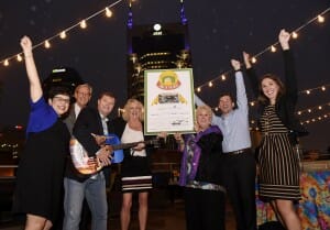
Nashville International Airport celebrates the addition of Alaska Airlines to it’s family of carries at an event at Aerial Thursday, Oct. 1, 2015 in Nashville, TN.
For more pictures and information about this event, check out this article
Everything 12th Table prints is beautiful. We feature the event design and hire company in our social media a lot for this reason. Lately, however, they’ve been creating print products that are just as pretty as they are innovative. 12th Table specializes in weddings, and they have been using acrylic displays to feature the seating charts. It doesn’t take a rocket scientist to realize this sign is easier on the eyes than a pamphlet or flyer. The transparent acrylic adds an extra touch of elegance that would otherwise be missing.
In addition to acrylic signage, 12th Table also created foil stamped wedding table cards. Sarah Ingram created the brush strokes and navy script, and we turned her strokes into gold foil. Although weddings aren’t intended to make a profit, foil stamping does increase purchase intent for companies with products and services to sell. As we mentioned in last week’s Friday Featured Project, foil stamping increases purchase intent by 70 percent and brand perception by 80 percent (in quality and efficacy).
For Therapy Systems, we created our first double-sided window cling (we were pretty pumped about it). As it sounds, a double-sided window cling is used on transparent windows to showcase an image to both the inside and outside of a building. Double the cling, double the impressions!
The Cosmetic Market ordered window clings for their upcoming Smashbox Photo Event on October 24th – their biggest event of the year. Fashion & celebrity photographer Drew Schwartz (a big deal, guys) is going to photograph those who attend (presumably in front of the step-and-repeat banner below). There will be other perks, as well, which you can learn more about here.
To give you some numbers, the value of on-site signage is equal to 24 full-page newspaper ads every year. According to the same study, replacing a storefront sign with a larger one will increase revenue by 7.7 percent for retail industries. In today’s digital age, people often overlook the efficacy of traditional on-site signage.
Disclaimer: we didn’t print the products below – we just think they are cool. And effective. If you’re going to promote an event, promote it well and often.
An eye-catching letterhead, like a good business card, is a crucial marketing opportunity. Sometimes it will be the first correspondence a customer has with you; sometimes it will be used to strengthen and reinforce your brand.
Whether you are making an announcement, asking for a donation or saying thank you, a well-designed letterhead adds validity to the words on the page. It forces your reader to take a second look and take the message more seriously.
Simplicity is a good design principle no matter the medium. But for letterhead, especially, simplicity is crucial. After all, a letterhead is supposed to deliver a message. You want your design to reinforce the words, not distract from them.
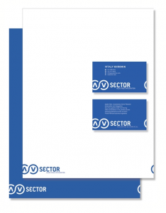
The only detail that is necessary on a letterhead is your logo. Everything is else is optional. The company address is available on the envelope, and customers can easily Google your phone number, email or website. However, if your company is small or just starting up, we recommend printing one preferred method of communication, such as an email address.
This may be intuitive, but place the most important information at the top and/or left side of the page. The eye naturally looks to the top, left side of any reading material, so you want to convey the most important content first. The eye also tends to notice the largest font or design first, so make sure to increase the size of the most prominent piece of information. Make the secondary information, such as email, phone number and address smaller (unless that happens to be your most crucial information).
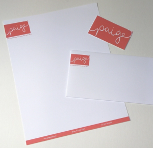
This is a design principle you should follow when creating any branded material. Our brains tend to remember illustrations better than words, which is why you have a logo in the first place. If you use dark blue when your brand color is baby blue, it will confuse your customers and weaken your brand overall.
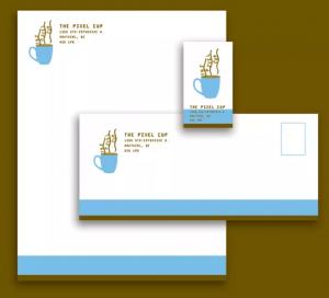
Occassionally you can get away with changing up the colors — but the design and typography must remain the same to instill brand recognition among consumers.
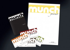
Another intuitive design principle is balance and positioning. You want to arrange your content in a way that creates symmetry. If you have your logo in the top left, maybe place a design on the bottom right corner. Or if your logo is centered at the top, try centering the address, phone number and email at the bottom. Your brain naturally looks for symmetry, and it makes us feel uncomfortable when it’s not there. For example, the letterhead below does not have any symmetry — the content is all crammed into the left side.
Some designers knowingly create asymmetric designs in order to grab readers attention. It’s a bold design move, but sometimes a good designer can pull it off.
People appreciate clever design. If there is a way to convey your products and services without telling readers, do it. It will give more credibility to your company or brand. Readers will think you are smarter than the competition, and they will appreciate you more. It also makes your brand or company more memorable.
Yes, yes — we say this every time. But it’s true! Specialty printing techniques such as foil stamping, edge painting, embossing, debossing and die cutting make your brand appear more professional and/or creative. The same goes for specialty, thick paper. We are tactile creatures, and we like things that have a unique feel. It increases customer engagement and triggers more memory receptors in the brain.
Similar to using the exact brand font and color, ensure that the overall design of your letterhead is similar to your business card, stationery, envelope and other print products. It creates brand cohesion and strength. If you want to be really neat-o, have the designs of your letterhead and business cards to form a larger design when placed side-by-side, as in the one below.
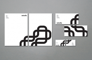
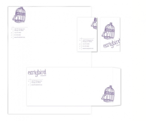
We love to show off our foil stamped products. For one, it is so elegant and beautiful (and looks great in photos). But more importantly, it adds real value to your brand: it increases visibility, brand awareness, brand differentiation, purchase intent, and it creates an image of professionalism and quality. To quantify these statements, according to Elliot Young, foil stamping increases purchase intent by 70 percent and increases brand perception by 80 percent (in quality and efficacy).
One of our customers, Harbor Entertainment, a company that provides complete event solutions, has been utilizing foil stamping really well. They’ve designed foil stamped shelf-signage and tabs for The Glenrothes. If you know anything about The Glenrothes, you know it is an exceptional whiskey — one of the best. To reinforce its high-quality image, The Glenrothes must have the best packaging and design.
The tabs Harbor Entertainment designed were part of a sales binder. The Glenrothes’ logo is foil stamped at the bottom right corner, as you can see above and below. Harbor Entertainment chose gold as the color because it is one of The Glenrothes’ brand standard colors.
The entire binder is incredible, including its thick leather cover with an embossed logo (we didn’t do the embossing).
To increase “shelf pop,” or shelf visibility, Harbor Entertainment created — you guessed it — foil stamped shelf signage. When a customer is browsing through a liquor store looking for a quality whiskey, you know he or she is going to see The Glenrothes first (if they can pronounce it is a different story).
Finished product:
As you can see, The Glenrothes will now have the coolest sales binder and shelf signage available. Your products could be this awesome too…
Some print shops have a regular copier that can print your black-and-white documents at a much lower price than a digital or offset press. It’s about the same price as copying documents yourself at a Kinko’s (at least ours is), but all the handiwork is done by the production staff at the printer.
Many customers will print booklets or pamphlets’ guts on the copier, and print the cover in color on the digital press. This saves a lot of money, and the end result still looks nice.
For special occasions, many customers want to add a special touch to their invitation, menu or postcard. Some prefer to have foil stamping or embossing, but if you’re trying to save money, you might look into specialty paper. It has the elegance of letterpress without the cost.
Postage costs can add up quickly. Stick with a standard-size invitation (length divided by height is less than 1.3 or more than 2.5) to save money. Square letters cost more because they don’t fit through the postal machines and have to be hand-stamped. On a similar note, avoid adding additional frills, clasps, string or buttons to the envelope. Don’t include items that make the envelope surface uneven, and avoid rigid items such as wood or metal. These things will increase postage cost.
When you know you have an event coming up, ask some printers how long it will take to complete such a job. If you have to place a rush on your order, it will increase cost.
If you are adamant about creating business card or postcard in a fun shape, ask your printer about the dies in-house. Creating a new die is expensive and time-consuming. Using an old die will take that step out of the die cutting process, saving you money and time.
To see the dies we have in storage, take a look at our online inventory
– photo by Stephanie M. Maiocco
Signs. We know — they aren’t the sexiest. But sometimes the simplest things can be the most powerful. This past week, Fifth Third Bank ordered 10,000 signs for fans at the Nashville Predators‘ game on Tuesday in order to support and spread awareness of Stand Up 2 Cancer, a movement created to accelerate innovative cancer research.
As most of you know, Fifth Third is the official bank of the Preds and Bridgestone Arena. The bank thought it could utilize these two sponsorships to create more momentum for SU2C. Thus, Fifth Third Bank ordered 10,000 signs printed for each predators’ fan at the Bridgestone Arena.
The sign reads “I stand up for” followed by a blank, white box. The fans were instructed to write a name in the box of someone he or she knew that battled or is currently battling cancer. When fans held up the signs together, the end result was very powerful:
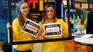
The concept of SU2C signs at sports arenas isn’t new — the signs were utilized at the Tampa Bay Rays baseball game in 2013:
And at San Francisco Giants/Detroit Tigers’ game in 2012:
In fact, in 2008, Major League Baseball became the founding donor of Stand Up To Cancer. SU2C has grown tremendously with support from players, fans and all 30 MLB Clubs. As of September 2014, Major League Baseball had donated more than $40 million to the organization.
Old-fashioned signs are often overlooked because of its commonality. But in some instances, especially with nonprofit causes and movements, commonality is key to gaining and keeping momentum.
“There’s a romantic feeling of pulling a photograph out of a polaroid camera, holding it in your hands and showing it to others. It can’t be replaced or replicated.” — Jack White
If you haven’t heard, Polaroid cameras have gone out of business. That is, until the Impossible Project stepped in to rescue its timeless machines. The Impossible Project is now the only company in the world producing instant film for classic Polaroid cameras.
Third Man Records is a big supporter of analog photography, so it became the inspiration for one of the Impossible Project’s special runs of limited-edition instant film. It develops in black and yellow, the colors of the label.
To launch this collaboration, Third Man selected three photographers to create a photo exhibition using the black and yellow film: Patrick Pantano, David Swanson and Third Man’s Angelina Castillo. The display opened last night at the label’s Blue Room from 7-9pm.
To celebrate the unique film, Third Man wanted to print some wide-format editions of the photos. There were several substrates from which to choose, including acrylic, aluminum, canvas, max metal and foam board.
Canvas is popular for those who wish to have the old-fashioned look of an oil painting (but don’t want to spend the money on traditional framing and modern photo mounting). If you know anything about Third Man Records, you know that they don’t go for the old-fashioned look.
Foam board and Gator board are popular mediums for events as they are easy to transport and affordable. They don’t look as nice as aluminum, max metal or acrylic. For this reason, Third Man nixed foam board.
Aluminum, max metal and acrylic all would have worked for Third Man’s art show, as all three have a sleek, modern look. They are all highly durable, lightweight and strong.
Third Man ended up choosing max metal, due to its specific look and because it prevents surface dings, scratching and denting better than any other substrate. It also happens to be the most cost-competitive composite board available.
To mount the graphics on the wall, we used black standoffs. Standoffs come in various colors, but Third Man wanted black as that is one of their signature colors. The end result looked very chic.
If you didn’t get a chance to see Third Man’s display last night, the exhibition will remain open through the Sept. 16th during normal Third Man hours. To learn more about the exhibit, click here or watch the promotional video below.
The Land Trust for Tennessee has several fundraising events throughout the year, including Once in a Blue Moon, a party at Glen Leven Farm that includes food, entertainment, drinks, boots, bonfire and bluegrass. Like many events, Once in a Blue Moon uses direct mail to increase awareness and attendance. If you don’t know a lot about direct mail, here are 6 tips you should follow.
A key fundamental of marketing is multiple touch points. Thus, it helps to send a couple direct mail pieces or to use a direct mail piece combined with a follow-up email. Land Trust decided to send two letters: a save the date card and the invitation. The save the date card should follow the same general design and layout as the invitation, but with less information. It should be a teaser to get people excited about the event.
It’s no surprise that people receive a lot of mail – most of it “junk mail.” The success of a direct mail campaign hinges on the audience opening the envelope before it gets thrown in the trash. Knowing this, Land Trust decided to splurge on the envelopes and use vellum as the material of choice. Vellum, as you can see from this picture, is transparent. It stands out from the other white envelopes in a stack of mail and piques readers’ interest.
Another benefit of vellum envelopes is its design potential. As you can see in the photo below, it appears as if a moon crescent is shining through the envelope, going along with the “Once in a Blue Moon” theme. You can also see the illusion of a starry sky and the date of the event on the bottom right corner.
Once you have piqued a reader’s interest, it’s important to retain it. This is where the invitation design and layout comes in. Land Trust used a ticket and a ticket sleeve to tell a small story. As you pull out the ticket, it shows four different moon stages with the sentence “Events like this happen only once in a blue moon.” It’s so clever! And as you can see from the sleeve, the design is simple enough that it makes the “story” and important details pop.
The 40/40/20 rule of direct marketing (and thus direct mail) is a formula for success that most businesses try to follow. The adage is that 40 percent of your direct marketing success depends on your audience, 40 percent depends on your offer, and 20 percent depends on everything else, such as design and layout.
This isn’t to say that you shouldn’t worry about design – you definitely should. But it is just as important to create a carefully targeted audience that will respond to your offer.
For more details on the 40/40/20 rule, visit this blog.
Once you have targeted the perfect audience, induced them to open your direct mail piece and delivered an enticing offer, it is crucial to make the call to action simple and convenient. People are busy, and they want to take you up on the offer only if it is convenient for them. Thus, Land Trust enclosed a return mailer with check boxes – super easy for readers to send.
Yes, we are the best printer of all time, obviously. But for those of you in California who don’t want to use a vendor that far away, make sure to use a nice printer. You can spend all the time and money on the design as you want, but if the quality of the paper is sh****, none of it matters. Also, some printers will stamp and mail your direct mail pieces out for you, saving you valuable time.
With so much media and signage today, it’s hard to break through the clutter. As most of you know, we got a super cool new machine — the EFI VUTEk H2000 Pro — which has more (and better) wide-format printing capabilities than ever before. Here are some neat ideas if you are in a wide-format printing rut.
Very few printers have the ability to print white ink. Most can print an image on a white background, creating the illusion of white ink. However, if you have a substrate that is not white — such as acrylic, wood, Gator board or max metal — you need that special ability. Although many consumers may not consciously realize it, there are relatively few signs on the market that contain white ink. Thus, this technique is a good way to break through the signage clutter.
The picture below isn’t exactly wide-format, but it does showcase the uniqueness of white ink printing.
When most people think of wide-format signage, they think of banners and posters. But what about your logo on an aluminum cutout? Or a max metal sign? This type of printing isn’t used as frequently, which makes it more memorable.
Max metal is a cool substrate to use in printing. Sometimes it looks like metal, and sometimes the end result appears to be a fancy type of glass, as shown in the pictures below. There are many different outcomes with max metal, which makes it one of our favorites.
If you would like to frame your company retreat (or a bucket of tomatoes), but don’t want to use a boring old photo, try printing on cloth canvas. It is sure to make passersby stop and stare.
Ok, we say this all the time. But it’s so true! There is so much blank real estate in your office that is just waiting to be used as advertising. Print your company timeline, your company name, your values or your latest campaign. An office is taken much more seriously when its door has the company name in frosted glass.
If you would like an architectural graphic that is more temporary, go with a wall cling. It is easy to remove and switch out.
Everyone loves magnets. There’s a reason people collect them! If you print the Tennessee Titans’ football schedule on a magnet with your company name advertised on the header, people are sure to keep those on their refrigerator throughout the season. Talk about repeated brand exposure!
Finally… cutouts. Everyone loves a cool cutout.
If you would like to come check out some more samples, please come visit us! We would love to give you a tour and show you our new VUTEk. Below are some videos of the VUTEk if you want a little sneak peak.
https://www.youtube.com/watch?v=fQlJeGdez9w https://www.youtube.com/watch?v=nvFRhSC3H1UAs every bride in America knows, letterpress is an elegant print method that makes a soft indentation (embossing) on card stock. We use a 1971 Heidelberg Windmill to create this clean, stunning design.
Recently, Judith Bright decided she wanted to revamp her print products, and it was only fitting to create letterpress notecards and jewelry tags. She makes gorgeous jewelry, and beautiful print products to add to her overall aesthetic.
In the image above, you can see that she prefers simple design and light colors. Her jewelry tags and informational cards have a light blue logo and her name in a gold color.
Her new cards maintain the simplicity of her original cards, but she decided to use foil-stamping and debossing to add an extra touch of elegance to her print products. The end result is nothing short of beautiful.
You can tell someone cares about his or her business and customers when he or she puts so much effort into the brand aesthetic. These tags and cards required several time-consuming steps, which we want to highlight. Understanding the letterpress process is very beneficial for anyone considering using this technique.
The first step of letterpress is design and layout. Judith wanted cards with rounded corners, which requires a die of its own. To make a physical die, you must first create an online version of the die. Most graphic designers should be able to do this. However, make sure that your graphic designer understands how to design for print.
To deboss (or emboss) anything, you must create a separate die (shown below). Again, you need an online template.
Although this isn’t really necessary, you can create an online mockup to see how the two dies will look when combined.
Once you have created a design and layout, it is time to send the file to your local printer. If they cannot make the die in-house, they should be able to find someone who can.
The above photo is the die cut die of the earring tags. The below photo is the emboss die of the same earring tags.
The only printing required on this set of tags and cards was for the one-inch necklace squares. “Judith Bright” is printed below the logo because it is too small to emboss.
Once you have created your dies and sent your cards to press, it is time to foil stamp your print products! This is where one uses the emboss die, as shown above. Applied with metallic foil and heat, the die creates a beautiful end product (shown below).
Almost done! Now it is time to use the letterpress. Again, we use a 1971 Heidelberg Windmill to die cut 4 earring tags at a time.
Finally, once everything is cut and stamped, it is time to punch out the final cards. Each individual card (and its jewelry holes) must be removed by hand.
After meticulous design, layout, letterpress and handwork, the cards and tags are complete. Stay tuned for Judith Bright gift cards… we are in the process of creating new ones!
Please contact us if you have any questions or would like a quote for letterpress or die cutting. We would love to help you if we can!
Brochure printing isn’t the sexiest, but it’s necessary for relaying information about your company, products or services. These advertising staples can get a little stale, so we’ve put together some tips to make your brochure memorable and informative.
100lb cover paper makes a big difference compared to 100lb text paper. It is surprisingly sturdier, which makes your brochure look more professional and durable.
Most printers have a variety of house paper from which you can choose. Felt, linen, gloss and matte are four popular options that are affordable but feel more substantial than text paper.
The average reader glances at the cover of a brochure for less than 5 seconds before deciding if he or she wants to read it. Make sure your headline is intriguing and graphics are aesthetically pleasing.
The same goes for the guts (or inside) of the brochure. Use bullet points, large fonts and fewer words to get your point across. Consumers are busy and have short attention spans.
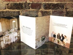

We all love a good trifold. With good design and intriguing copy, a trifold can be a very effective medium for relaying information. However, most people use a classic trifold as their brochure layout of choice, so it becomes harder to stand out. There are so many different folds that people forget, such as the ones below.
One of our favorites is the z-fold, also known as the zig-zag or accordion fold. Some people differentiate the z-fold and accordion fold by panels, as a z-fold typically has six panels and an accordion has 8 or more, but they are folded the same way. If you look at a z-fold from an aerial view, it will look like the letter “Z.”
A z-fold is beneficial because of its versatility. The brochure can open with one pull, allowing the design to be able to span the entire sheet of paper.
If you do choose to go with a trifold, we recommend making tiny tweaks, such as making one flap short or making the brochure more square than rectangular. It’s different enough that it makes the brochure stand out.
A good design welcomes a reader into the brochure. The best designs are relatively simple in nature and reinforce the overall message of the brochure.
A basic but crucial design tip is using complementary colors to create visual harmony.
Above, Ensworth uses their signature color, orange, with its complementary color, blue, to create a brochure that is visually appealing and balanced.
In addition to using complementary colors, a designer can choose to create a layout in the shape of its company’s message. For example, the brochure below, designed to look like a CD cover, is supposed to convince out-of-state companies to use Nashville as the place to hold conventions or meetings. The CD cover plays on Nashville’s reputation as “Music City USA.”
Emma, a successful company that offers email marketing services, created a brochure in the shape of an iPhone to reinforce the brochure’s message that a phone is becoming a mobile email inbox. It’s genius!
As with everything else we print, a good finishing technique can make the difference between an average brochure and great brochure. Die cutting, embossing, foil stamping and laminating are a few we use to make a brochure really stand out.
Other tips to keep in mind are resolution and bleed. If you send a photo to your printer, make sure it is at least 300 dpi and make sure it has bleed. Any questions? Let us know!Wedding invitations can be beautiful without spending a fortune. Here are ten tips to ensure your stationery cost stays within your budget.
Stationery stores are a great starting place for ideas, but they have large markups on the paper and printing. A designer, too, will be much more expensive than if you went straight to a printer. Some print shops have an in-house designer, but you can also get crafty and design your own invites. Sites like Wedding Paper Divas, Printable Press and E.M. Papers will help you create pretty designs yourself.
Creating a wedding logo — even a simple monogram — is an easy way to make your invitations (and other wedding cards) look more polished. It ties everything together and shows you really care about the little details. Once you have a logo, create a motif that goes along with it. It’s easier to develop a design based off of a monogram than developing one from scratch.
If you do decide to use an in-house graphic designer at a print shop, know all the details before you come in. It does not help you to give the designer half the information earlier. Most designers bill by the hour, and if he or she has to go back and add or change details, it will cost you. Talk to your wedding planner and have a schedule set in stone before you go to your printer.
Many brides want a particular paper to make their wedding invitations extra special. However, most printers already house nice papers. Felt and linen paper are two popular options because they have a classic look and feel. If a printer has to order a different paper, it will cost more. Also, many times, the “special papers” are way over-priced. Ask your printer what kind of paper they house before you tell them what kind of paper you want. They might even have some leftover samples that will cut your cost significantly.
Postage costs can add up quickly. Stick with a standard-size invitation (length divided by height is less than 1.3 or more than 2.5) to save money. Square letters cost more because they don’t fit through the postal machines and have to be hand-stamped. On a similar note, avoid adding additional frills, clasps, string or buttons to the envelope. Don’t include items that make the envelope surface uneven, and avoid rigid items such as wood or metal. These things will increase postage cost.
As you can guess, using postcards for save-the-date cards or wedding invites saves money by eliminating the envelope. Often, postcards can be more creative and fun than classic invitations.
There will inevitably be a guest or two you forgot or want to add last-minute. Save yourself the time and money by printing a few extra invitations to avoid ordering a second print job. It’s always nice to have an extra invite for your wedding scrapbook, as well.
Digital and offset printing cost much less than letterpress and engraving. Embossing and foil-stamping is beautiful, but is much more labor-intensive than modern printing techniques, and therefore more expensive. Use a digital printer if you are printing hundreds of invitations. Use an offset printer if you are printing more than 5,000.
Most print shops can mail your invitations for you, as well as customize the guest and return addresses. This costs more — especially the stamping. Most printers hand-stamp each invite, which is time- and labor-intensive. Stamp your invites yourself and handwrite each address. It will add a personal touch and won’t break the bank.
Finally, proofread! Proofread! Proofread! Reprinting your wedding invitations will cost you a fortune.
For wedding invitation design ideas, visit our Pinterest page. We have many designs that we have printed throughout the years. We remove most of the names and important details to ensure our customers’ privacy.Sticker printing sounds a tad juvenile. But don’t be fooled — our adhesives make great architectural graphics, furniture graphics and printed household items.
If you read our blog last week, you saw some of Village’s door and wall graphics:
If we told you this was a fancy sticker, would you believe us? Didn’t think so.
One of our customers, American Born Moonshine, has taken advantage of our new sticker printing abilities and created some pretty cool graphics. We thought we would show you a few to get you thinking about some stickers you might like to print for yourself.
Take these coolers, for example:
What better way to advertise your liquor business than to create custom-branded coolers? American Born Moonshine is an expert in target marketing. They know their customers are patriotic and have a “fiercely independent spirit,” so they incorporated the Gadsden flag into their coolers.
How about some stickers in the shape of Tennessee?
People love Tennessee. People love moonshine. It’s perfect!
How about some bar mats or countertop mats?
It prevents water rings, protects your countertop AND advertises your brand. It’s super easy to peel, too.
Also, look at that tagline — “The smooth side of a rough history.” The bar mat is printed on vinyl, an ultra smooth material. Punny, right?
Ok, so these few products don’t have anything to do with stickers… But they’re cool! And we want to show them off. Vinyl banners, blow-through banners and table tops, respectively, are another great advertising medium.
What do you think about our sticker printing abilities? Pretty cool, huh?Building graphics (or architectural graphics) are a hot marketing technique right now. Like outside graphics, they are a cost-effective method of advertising your business. Building graphics are instant and flexible. As Village Real Estate knows, empty office space is — no pun intended — blank real estate. Thus, Village has decided to amp up their office with door, window and lobby graphics. We think their new products are too cool to not show off, so we’ve put together some images of their newly-amped-up office.
Our first wide-format project for Village was a wall graphic. We created their name with our new VUTEk machine, which prints with ultra high-quality and precision. Now, when a customer walks into Village’s office, they are immediately reminded of the company’s brand name, colors, design and culture.
Similar to wall graphics, door graphics are an often-overlooked method of advertising. This type of door graphic is called etched glass vinyl or “frosted glass.” It looks classic and professional.
Village Real Estate chose to use frosted glass to decorate their windows, as well, giving their business a very professional, aesthetically-pleasing appearance. Window graphics are perfect for invoking passerby curiosity and, like outside graphics, repeated exposures. According to Charles R. Taylor and John C. Kozup, the cumulative effect of these repeated exposures is more effective than isolated advertising techniques.
Alright, so these technically aren’t architectural graphics, but they are graphics on architecture… With our new machines, we can print a wider variety of hanging wall art than ever before. Metal, aluminum, acrylic, wood and stretch canvas are now in our portfolio of substrates. Village Real Estate decided to go with max metal, and the end result looks b-e-a-u-tiful! The photographs for these pieces were done by the wonderful Kevin Schlatt. Find more of his work and contact info at http://peteypete.smugmug.com/.
Check out Kevin’s Facebook page for more photos of his work.
Village also wanted us to install a typographic mural for their office, which can be seen below. It was designed by Hunter Mize, and we used vinyl and laminate to implement the artwork on the canvas. This particular piece is called “To-The-Edge Hood Print.” To purchase this art or to see more of Mize’s work, visit his Pinterest page.
So who’s ready to amp up their office next??
– The amp team
Outdoor graphics is one of the fastest growing segments of the printing and marketing industry, due mostly to the expanded capabilities of today’s digital printing technology, the integration of digital technology* with outdoor signage and the commercial success of outdoor advertising.
Some of you may be thinking, “what does this have to do with me and my company?” Well, my friend, it matters because – like social media – it is an increasingly successful marketing technique. No matter what industry you are in, marketing is and always will be important.
Due to the advancement in today’s digital print technology, there is a greater variety of (and better quality) outdoor signage. UV-printed material is becoming the new norm for large-format posters and banners as it protects the substrates from the sun. Prints that are not UV-resistant tend to fade, making the graphic difficult to read and your advertisement less effective. Faded colors give less of a “pop” for viewers, and thus less of an impact.
You can tell the large poster and banner above are UV-printed by their high shine.
Mesh is being used more frequently in outdoor advertisements, as its tiny air holes allow wind to flow through the graphic and create less of a force against it.
Similar to mesh, fabric is gaining in popularity. It has more longevity than other types of signage and does not create glare.
Digital technology is desirable because of its interactive and data collection capabilities, while printed displays have a certain aesthetic that many advertisers still prefer. Thus, more companies have been combining the two to receive the benefits of both digital and print displays.
For example, a well-known billboard in London created by agency WCRS, Women’s Aid and Ocean Outdoor used facial recognition to recognize when people were paying attention to the image of a bruised woman. As more people looked at the ad, her injuries healed faster, insinuating that it’s wrong to turn a blind eye to domestic violence. The advertisement received much more success, attention and press than it would have with a print advertisement alone.
Here’s a video if you would like to see how the billboard changes:
More and more people are recognizing the benefits of out-of-home advertising. According to Epic Outdoor Advertising, OOH advertising is more cost-effective than any other type of advertising, it is the only type of advertising that has constant exposure, and it has a larger audience than any other type of advertisement.
Consider car decals. According to the American Trucking Association, vehicle ads generate more than 600 visual impressions for every mile driven. That’s hundreds of thousands of impressions per year!
Vehicle ads don’t have to be big. Bumper stickers generate just as many impressions, and they are a lot less expensive.
At least for us, door graphics requests have increased. What better way to brand or advertise your company than to do it right when people walk in the door?
According to Richard Romano with What They Think, construction site graphics have become especially popular. Downtown Nashville, in particular, has construction sites on almost every corner. These sites are valuable advertising space for the owners of the property, and it would be a waste not to use it.
Now that you know the trends in outdoor graphics, are you ready to get started with your out-of-home ads?
– The amp team
*Although this may be a no-brainer for some of our readers, there is a difference between “digital technology” and “digital print technology.” Digital is making use of or relating to computers or computerized technologies, while digital printing is a type of printing that is meant for small-run or medium-run jobs and has a faster turnaround time than offset printing.
As most of you know, die cuts are just a fancy print term for “cut outs” or shapes. An encyclopedic definition of die cutting would be: a process used in many different industries to cut a thin, flat material into a specific shape using a steel cutting die. We mostly die cut paper and stickers at amp. The benefits of die cutting include visual appeal and a good marketing technique. A fun shape will have a lingering impression on the viewer, making you or your company stand out.
To create die cuts, you must first have a “die” or “die line:” a template that ensures proper layout for a printed product. A graphic designer can create the die line on the computer first and transfer the shape to a physical die. Below are 4 images of the process: the first is a digital picture of a soapbox die, designed on the computer. The second and third images are the physical die and a paper piece stamped out on the letterpress. The last image is the finished product, a beautifully assembled soap box.
Click to enlarge.
At amp, we use a 1971 Heidelberg Windmill to die cut. We also refer to it as our letterpress.
Because die cutting is a specialty that requires more set-up and finishing, it is a bit more costly. However, if a print shop already has a die made that you like, your project’s cost and time decreases. For this reason, we have made you an inventory of the dies we house at amp. This is not a complete list, as we have several company-specific dies, but it is a good start if you are looking for basic shapes. We will continually update this blog so that you always have the most up-to-date information.
Don’t see anything here you like? Ask us! We may have that die in-house. Again, this list is not comprehensive. If we don’t have the die, we can always make it!
Happy die cutting!
– Your friends at amp
We love small businesses. We are a small business. As most of you know, fifteen years ago, amp consisted of Matt Simms, his laptop, a plastic chair and the local Kinko’s. Today, amp is home to ten individuals and several large printing and finishing machines. Due to Matt’s hard work, amp is now known around Nashville for its local roots, its entrepreneurial spirit and its friendly atmosphere.
We’re proud of our company’s history and all small business employees who enrich their community. In honor of National Small Business Week, we wanted to share a few interesting facts and advantages of small businesses.
1. There are 28 million small businesses in the U.S.
2. 70 percent of small businesses are owned and operated by a single person.
3. Nashville was chosen as one of six locations by the U.S. Small Business Administration to open a Women’s Business Center across the country in 2015.
4. 29 percent of Tennessee’s economic activity is due to small businesses.
5. More than half of Americans either own or work for a small business.
6. It takes just 6 days to start a business in the US, compared to 38 days in China.
7. It costs 6x as much to start a business in India than in the US.
8. Small businesses create about two out of every three new jobs in the United States each year.
9. Immigrants make up 12.5 percent of small business owners nationwide.
10. Federal Reserve Chair Janet Yellen said it was our small businesses that powered our recovery after the Great Recession.
11. America is one of the few countries that give entrepreneurs a seat at the President’s cabinet table.
12. Small businesses pay 44 percent of the country’s payrolls.
13. Local business generates 70 percent more local economic activity per square foot than big box retail.
14. The U.S. transports and ships $2.2 trillion worth of products from over 150 countries each year. International shipping and transport result in 1.1 billion gallons of fuel used and1 billion metric tons of CO2 per year. Shopping locally helps cut down on processing, packaging and transportation waste, leading to less pollution.
15. If every family in the U.S. spent an extra $10 month at a locally owned, independent business instead of a national chain, over $9.3 billion would be directly returned to our economy.
Why Buying Local is Worth Every Cent